
Radio Select
This webview component allows users to choose a single option from a list of items. Each item can include a title, subtitle, image, and an action that is triggered upon selection.
Example usage
The following example demonstrates how to create a Radio Select webview. In this example, three categories are provided. When the user selects an option, a specified event is triggered with an associated parameter.
async payload => {

  const url = await webview.radioSelect.create({
    ref: 'category',
    title: 'Choose a category',
    items: [{
      title: 'Cat',
      subtitle: 'meows a lot',
      onSelect: {
        eventName: 'select',
        params: new Param('category', 'animal')
      }
    }, {
      title: 'Feline',
      subtitle: 'purrs a bit',
      onSelect: {
        eventName: 'Select',
        params: new Param('category', 'species')
      }
    }, {
      title: 'Kitten',
      subtitle: 'sleeps in abundance',
      onSelect: {
        eventName: 'Select',
        params: new Param('category', 'young')
      }
    }]
  })

  const buttons = new Buttons('Select a category')
  buttons.addButton(new Button({
    label: 'Choose category',
    type: 'webview',
    value: url
  }))

  const message = new Message(`Select a category ${url}`)
  message.addResponse(buttons)

  return message
}
Properties
When creating a Radio Select webview, you can configure the following properties:
| Property | Type | Example | Description |
|---|---|---|---|
ref | string | pickup-date | Optional. Identifier to update the webview content. |
title | string | Choose a date | Required. Descriptive title shown at the top of the webview. |
tint | string | #FF0000 | Optional. Tint color used for the buttons. |
search | boolean | true | Optional. Displays a search bar when set to true. |
button.label | string | Choose item | Optional. Label for the confirmation button. |
Items
The Radio Select component is built using individual items. Each item represents an option and can include the following properties:
Properties
| Property | Type | Example | Description |
|---|---|---|---|
title | string | Awesome Phone | Required. The main text for the item. |
subtitle | string | 10" screen with 12GB memory | Optional. Secondary text. |
lineBreakMode | string | wrap | Optional. Use 'wrap' to enable multi-line titles. |
image | string | https://.../thumbnail.png | Optional. URL for an image thumbnail to display with the item. |
onSelect.eventName | string | "Date selected" | Required. Event name triggered when the item is selected. |
onSelect.param | Param or array | new Param('productiId', 112234) | Optional. Parameter(s) sent when the item is selected. |
Item Examples
Item with image
Each item can include a thumbnail image. By default, the image is displayed as a square.
Recommended thumbnail size: At least 80x80 pixels.
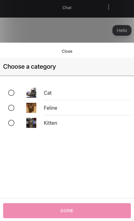
const url = await webview.radioSelect.create({
  ...
  items: [{
    title: 'Cat',
    image: 'https://...',
    onSelect: {
      eventName: 'select',
      params: new Param('category', 'animal')
    }
  }]
  ...
})
Item with subtitle
An item can include a subtitle to provide additional context.
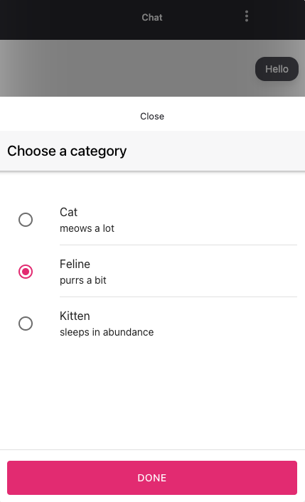
const url = await webview.radioSelect.create({
  ...
  items: [{
    title: 'Cat',
    subtitle: 'meows a lot',
    onSelect: {
      eventName: 'select',
      params: new Param('category', 'animal')
    }
  }]
  ...
})
Item with subtitle and image
You can also combine an image and a subtitle for a more descriptive option.
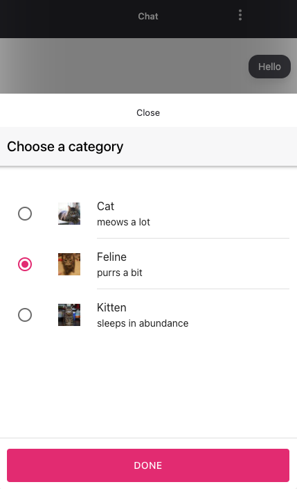
const url = await webview.radioSelect.create({
  ...
  items: [{
    title: 'Cat',
    image: 'https://...',
    subtitle: 'meows a lot',
    onSelect: {
      eventName: 'select',
      params: new Param('category', 'animal')
    }
  }]
  ...
})
Updated 2 months ago