
Multiple Select
The Multiple Select webview allows users to select multiple options from a list. It functions similarly to the Radio Select webview, but supports multiple selections.
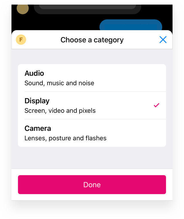
Example usage
The following example demonstrates how to create a Multiple Select webview. In this example, three categories are provided. When a user selects an option, an event is triggered with the corresponding parameter.
async payload => {

  const url = await webview.multipleSelect.create({
    ref: 'category',
    title: 'Choose a category',
    eventName: 'select',
    items: [{
      title: 'Audio',
      subtitle: 'Sound, music and noise',
      onSelect: {
        params: new Param('category', 'audio')
      }
    }, {
      title: 'Display',
      subtitle: 'Screen, video and pixels',
      onSelect: {
        params: new Param('category', 'display')
      }
    }, {
      title: 'Camera',
      subtitle: 'Lenses, posture and flashes',
      onSelect: {
        params: new Param('category', 'display')
      }
    }]
  })

  const buttons = new Buttons('Select categories')
  buttons.addButton(new Button({
    label: 'Choose categories',
    type: 'webview',
    value: url
  }))

  const message = new Message(`Choose categories ${url}`)
  message.addResponse(buttons)

  return message
}
Properties
When creating a Multiple Select webview, you can configure the following properties:
| Property | Type | Example | Description |
|---|---|---|---|
ref | string | pickup-date | Optional. Identifier to update the webview. |
title | string | Choose a date | Required. The title displayed at the top. |
tint | string | #FF0000 | Optional. Tint color is used for the buttons. |
search | boolean | true | Optional. Displays a search bar if set to true. |
button.label | string | Choose item | Optional. Label for the confirmation button. |
Items
The multiple select is based on a number of items. Each individual can contain a title, subtitle, image and onSelect property.
Properties
| Property | Type | Example | Description |
|---|---|---|---|
title | string | Awesome Phone | Required. The main text for the item. |
subtitle | string | Ri10" screen with 12GB memory | Optional. An optional secondary text. |
image | string | https://.../thumbnail.png | Optional. URL of an image thumbnail to display with the item. |
onSelect.eventName | string | "Date selected" | Required. Event name triggered when the item is selected. |
onSelect.param | Param or array | new Param('productiId', 112234) | Optional. Parameter(s) sent when the item is selected. |
Item Examples
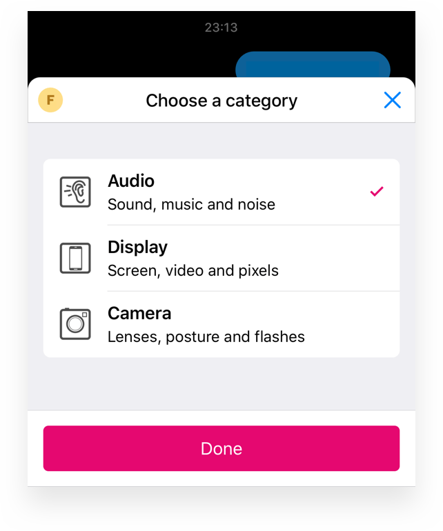
Item with image
Each item can include a thumbnail image. The recommended size for thumbnails is at least 80x80 pixels.
const url = await webview.multipleSelect.create({
  ...
  items: [{
    title: 'Audio',
    image: 'https://...',
    onSelect: {
      eventName: 'select',
      params: new Param('category', 'audio')
    }
  }]
  ...
})
Item with subtitle
An item may also include a subtitle to provide additional information.
const url = await webview.multipleSelect.create({
  ...
  items: [{
    title: 'Audio',
    subtitle: 'Sound, music and noise',
    onSelect: {
      eventName: 'select',
      params: new Param('category', 'audio')
    }
  }]
  ...
})
Item with subtitle and image
You can combine both an image and a subtitle for a more descriptive item.
const url = await webview.multipleSelect.create({
  ...
  items: [{
    title: 'Audio',
    image: 'https://...',
    subtitle: 'Sound, music and noise',
    onSelect: {
      eventName: 'select',
      params: new Param('category', 'audio')
    }
  }]
  ...
})
Updated 2 months ago