Customization (Brand Messenger in iOS)
Customize your user experience in the Brand Messenger iOS SDK
Our SDK includes a pre-built UI that you can use to integrate with your application. This article describes all the things in the pre-build UI that you can customize.
Use the KBMConfiguration object to customize the appearance of our UI. You can overwrite the defaultConfiguration in BrandMessengerManager and add custom configs.
let config = KBMConfiguration()
/// Change properties here...
/// Read below to know about different properties used in `KBMConfiguration`
BrandMessengerManager.setDefaultConfiguration(config)
Navigation bar
Color
You can change the appearance/colors of the navigation bar. To do so, you must create UINavigationBar.appearance.
let navigationBarProxy = UINavigationBar.appearance(whenContainedInInstancesOf: [KBMBaseNavigationViewController.self])
navigationBarProxy.isTranslucent = false
Background Color
To change the navigation bar's background color, edit the barTintColor value, shown below.
This value is used in all ViewControllers where the navigation bar is visible.
navigationBarProxy.barTintColor
          = UIColor(red: 0.93, green: 0.94, blue: 0.95, alpha: 1.0)
Tint color
To change the navigation bar's tint color, edit the tintColor value, shown below.
DEFAULT: UIColor.navigationTextOceanBlue
This value is used in all the ViewControllers where the navigation bar is visible.
navigationBarProxy.tintColor
          = UIColor.red
Title Color
To change the navigation bar's title color, edit the titleTextAttributes value, shown below.
DEFAULT: UIColor.black
This value is used in all the ViewControllers where the navigation bar is visible.
navigationBarProxy.titleTextAttributes = [NSAttributedString.Key.foregroundColor: UIColor.white]
Bottom Line
Toggle the navigation bar on and off using the hideNavigationBarBottomLine config.
If true the navigation bar is hidden.
If false, the bottom line of the navigation bar is visible.
DEFAULT: true
The setting controls all the ViewControllers where the navigation bar is visible.
config.hideNavigationBarBottomLine = true
Back button configuration
The back button icon can be customized
var config = KBMConfiguration()
/// Set conversationViewControllerBackIcon to desired UIImage
config.conversationViewControllerBackIcon = UIImage(named: "close-icon-name-here", in: .main, compatibleWith: nil)
BrandMessengerManager.setDefaultConfiguration(config)
Change Right Navigation Item
To customize the right-most navigation bar item in the Chat Detail screen, edit the rightNavBarSystemIconForConversationView value, shown below.
You can choose to show or hide an image or use the system icon.
DEFAULT: UIBarButtonItem.SystemItem.refresh
/// If you want to use the system icon
config.rightNavBarSystemIconForConversationView = UIBarButtonItem.SystemItem.add
/// If you want to hide the bar item
config.hideRightNavBarButtonForConversationView = true
/// If you want to hide refresh button
config.isRefreshButtonEnabled = false
Custom Navigation Buttons
This section describes how to add the custom navigation button in the Conversation View controller navigation bar and how to handle the Click or Tap of button notification callbacks in your app.
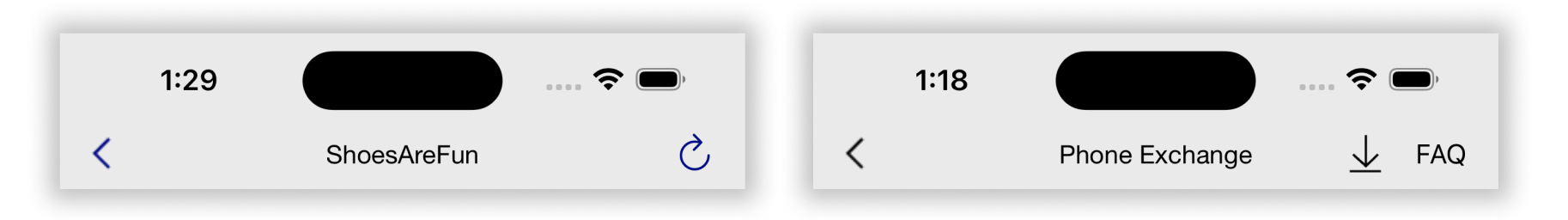
You can add a custom button in two ways: text or UIImage. The code below shows how to add KBMNavigationItem in both ways and how to handle the notification observer tap.
var navigationItemsForConversationViewController = [KBMNavigationItem]()

// Example for button with text
let buttonOne = KBMNavigationItem(identifier: 1234, text: "FAQ")

// Example for button with icon
let buttonTwo = KBMNavigationItem(identifier:23456, icon: UIImage(named: "icon_download", in: Bundle(for: KBMConversationViewController.self),compatibleWith: nil)!)

// Adding an item in the list
navigationItemsForConversationViewController.append(buttonTwo)

// Set the KBMNavigationItem array of objects to config
config.navigationItemsForConversationView = navigationItemsForConversationViewController

// Add an Observer to get the event callback
NotificationCenter.default.addObserver(forName: NSNotification.Name(rawValue: KBMNavigationItem.NSNotificationForConversationViewNavigationTap), object: nil, queue: nil, using: { notification in
     guard let notificationUserInfo = notification.userInfo else { return }
     let identifier = notificationUserInfo ["identifier"] as! Int
     print( "Navigation button click for identifier in Conversation view controller is :", identifier)
})
Text
See section on Navigation Bar Title for more info on customizing the text for the navigation bar.
Chat Bubble
You can change the font, text color, and background color of messages. Commonly edited options are listed below. Add these style-related changes to your AppDelegate's didFinishLaunchingWithOptions method or anywhere else before the chat is launched.
Color
The background color of the sent and received chat bubble.
KBMMessageStyle.sentBubble.color = UIColor.lightGray // For sent messages
KBMMessageStyle.receivedBubble.color = UIColor.lightGray // For received messages
Padding
The padding to left/right of the chat bubbles to the screen-edge can be adjusted.
KBMMessageStyle.sentBubble.cellMargin = .init(left: 20, right: 20)
KBMMessageStyle.receivedBubble.cellMargin = .init(left: 20, right: 20)
Sent messages Chat cell Spacing customization
The spacing/padding of sent messages cell views like Time label, Status, Message bubble, Link preview bubble, Document, Location, Video, Voice and Image Message.
// Time Label with default values can be customized
ChatCellPadding.SentMessage.TimeLabel.bottom = 2.0
ChatCellPadding.SentMessage.TimeLabel.right = 10.0
ChatCellPadding.SentMessage.TimeLabel.left = 2.0

// Status View with default values can be customized
ChatCellPadding.SentMessage.StatusView.bottom = 2.0
ChatCellPadding.SentMessage.StatusView.right = 2.0

// Message with default values can be customized
ChatCellPadding.SentMessage.Message.top = 1.0
ChatCellPadding.SentMessage.Message.bottom = 1.0
ChatCellPadding.SentMessage.Message.left = 95.0
ChatCellPadding.SentMessage.Message.lastMessageBottom = 5.0

// Link Preview Message with default values can be customized
ChatCellPadding.SentMessage.LinkPreviewMessage.top = 1.0
ChatCellPadding.SentMessage.LinkPreviewMessage.bottom = 1.0
ChatCellPadding.SentMessage.LinkPreviewMessage.left = 30.0
ChatCellPadding.SentMessage.LinkPreviewMessage.lastMessageBottom = 5.0

// Document with default values can be customized
ChatCellPadding.SentMessage.Document.top = 1.0
ChatCellPadding.SentMessage.Document.bottom = 1.0
ChatCellPadding.SentMessage.Document.left = 57.0
ChatCellPadding.SentMessage.Document.lastMessageBottom = 5.0

// Location with default values can be customized
ChatCellPadding.SentMessage.Location.top = 1.0
ChatCellPadding.SentMessage.Location.bottom = 1.0
ChatCellPadding.SentMessage.Location.width = 250.0
ChatCellPadding.SentMessage.Location.height = 250.0
ChatCellPadding.SentMessage.Location.lastMessageBottom = 5.0

// Video with default values can be customized
ChatCellPadding.SentMessage.Video.top = 1.0
ChatCellPadding.SentMessage.Video.bottom = 1.0
ChatCellPadding.SentMessage.Video.left = 48.0
ChatCellPadding.SentMessage.Video.lastMessageBottom = 5.0
ChatCellPadding.SentMessage.Video.widthRatio = 0.75

// Voice with default values can be customized
ChatCellPadding.SentMessage.Voice.top = 1.0
ChatCellPadding.SentMessage.Voice.bottom = 1.0
ChatCellPadding.SentMessage.Voice.left = 70.0
ChatCellPadding.SentMessage.Voice.lastMessageBottom = 5.0
ChatCellPadding.SentMessage.Voice.height = 55.0

// Image Message with default values can be customized
ChatCellPadding.SentMessage.ImageMessage.top = 1.0
ChatCellPadding.SentMessage.ImageMessage.bottom = 1.0
ChatCellPadding.SentMessage.ImageMessage.left = 58.0
ChatCellPadding.SentMessage.ImageMessage.lastMessageBottom = 5.0
ChatCellPadding.SentMessage.ImageMessage.heightRatio = 0.50
ChatCellPadding.SentMessage.ImageMessage.widthRatio = 0.75
Received Messages Chat cell Spacing customization
The spacing/padding of Received messages cell views like Name label, Avatar Image, Time label, Message bubble, Link preview bubble, Video, Document, Location, Voice, Image Message, Suggested replies/Quick Reply, Link Button, Image Rich Message, InlineForm and Card message.
// Name Label with default values can be customized
ChatCellPadding.ReceivedMessage.NameLabel.top = 6.0
ChatCellPadding.ReceivedMessage.NameLabel.left = 52.0
ChatCellPadding.ReceivedMessage.NameLabel.right = 57.0
// Avatar Image with default values can be customized
ChatCellPadding.ReceivedMessage.AvatarImage.bottom = 0
ChatCellPadding.ReceivedMessage.AvatarImage.height = 37
ChatCellPadding.ReceivedMessage.AvatarImage.width = 37
// Time Label with default values can be customized
ChatCellPadding.ReceivedMessage.TimeLabel.bottom = 2.0
// Message with default values can be customized
ChatCellPadding.ReceivedMessage.Message.top = 1.0
ChatCellPadding.ReceivedMessage.Message.bottom = 1.0
ChatCellPadding.ReceivedMessage.Message.firstMessageTop = 5.0
ChatCellPadding.ReceivedMessage.Message.lastMessageBottom = 5.0
ChatCellPadding.ReceivedMessage.Message.left = 15.0
ChatCellPadding.ReceivedMessage.Message.right = 55.0
// Link Preview Message with default values can be customized
ChatCellPadding.ReceivedMessage.LinkPreviewMessage.top = 1.0
ChatCellPadding.ReceivedMessage.LinkPreviewMessage.bottom = 1.0
ChatCellPadding.ReceivedMessage.LinkPreviewMessage.firstMessageTop = 5.0
ChatCellPadding.ReceivedMessage.LinkPreviewMessage.lastMessageBottom = 5.0
ChatCellPadding.ReceivedMessage.LinkPreviewMessage.left = 15.0
ChatCellPadding.ReceivedMessage.LinkPreviewMessage.right = 10.0
// Video with default values can be customized
ChatCellPadding.ReceivedMessage.Video.top = 1.0
ChatCellPadding.ReceivedMessage.Video.bottom = 1.0
ChatCellPadding.ReceivedMessage.Video.firstMessageTop = 5.0
ChatCellPadding.ReceivedMessage.Video.lastMessageBottom = 5.0
ChatCellPadding.ReceivedMessage.Video.left = 15.0
ChatCellPadding.ReceivedMessage.Video.right = 55.0
ChatCellPadding.ReceivedMessage.Video.widthRatio = 0.80
// Document with default values can be customized
ChatCellPadding.ReceivedMessage.Document.top = 1.0
ChatCellPadding.ReceivedMessage.Document.bottom = 1.0
ChatCellPadding.ReceivedMessage.Document.firstMessageTop = 5.0
ChatCellPadding.ReceivedMessage.Document.lastMessageBottom = 5.0
ChatCellPadding.ReceivedMessage.Document.left = 15.0
ChatCellPadding.ReceivedMessage.Document.right = 55.0
// Location with default values can be customized
ChatCellPadding.ReceivedMessage.Location.top = 1.0
ChatCellPadding.ReceivedMessage.Location.bottom = 1.0
ChatCellPadding.ReceivedMessage.Location.firstMessageTop = 5.0
ChatCellPadding.ReceivedMessage.Location.lastMessageBottom = 5.0
ChatCellPadding.ReceivedMessage.Location.left = 15.0
ChatCellPadding.ReceivedMessage.Location.width = 250.0
ChatCellPadding.ReceivedMessage.Location.height = 250.0
// Voice with default values can be customized
ChatCellPadding.ReceivedMessage.Voice.top = 1.0
ChatCellPadding.ReceivedMessage.Voice.bottom = 1.0
ChatCellPadding.ReceivedMessage.Voice.firstMessageTop = 5.0
ChatCellPadding.ReceivedMessage.Voice.lastMessageBottom = 5.0
ChatCellPadding.ReceivedMessage.Voice.left = 15.0
ChatCellPadding.ReceivedMessage.Voice.right = 30.0
ChatCellPadding.ReceivedMessage.Voice.height = 55.0
// Image Message With default values can be customized
ChatCellPadding.ReceivedMessage.ImageMessage.top = 1.0
ChatCellPadding.ReceivedMessage.ImageMessage.bottom = 1.0
ChatCellPadding.ReceivedMessage.ImageMessage.firstMessageTop = 5.0
ChatCellPadding.ReceivedMessage.ImageMessage.lastMessageBottom = 5.0
ChatCellPadding.ReceivedMessage.ImageMessage.right = 56.0
ChatCellPadding.ReceivedMessage.ImageMessage.left = 15.0
ChatCellPadding.ReceivedMessage.ImageMessage.heightRatio = 0.50
ChatCellPadding.ReceivedMessage.ImageMessage.widthRatio = 0.50
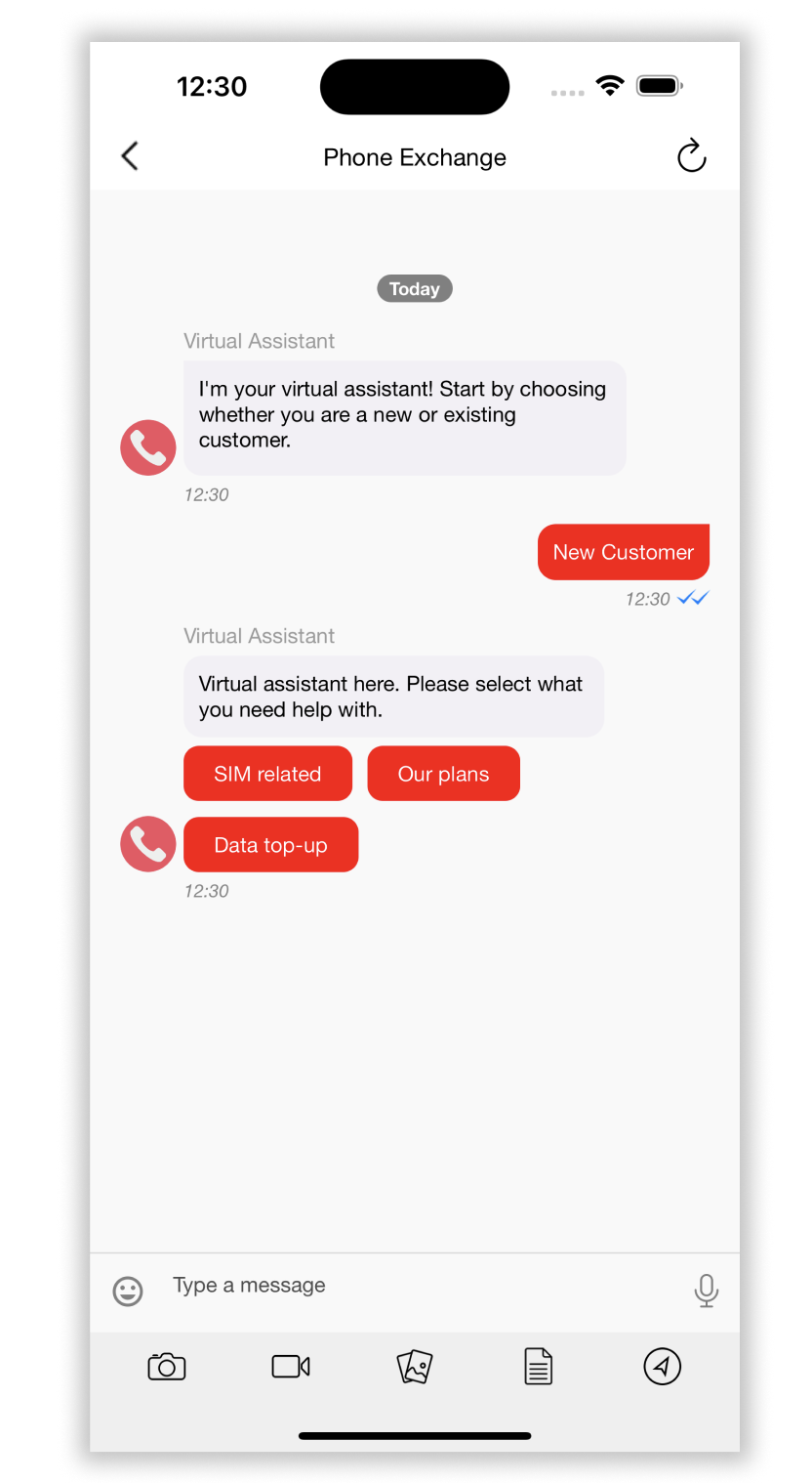
// QuickReply default values can be customized
ChatCellPadding.ReceivedMessage.QuickReply.top = 5.0
ChatCellPadding.ReceivedMessage.QuickReply.bottom = 5.0
ChatCellPadding.ReceivedMessage.QuickReply.firstMessageTop = 5.0
ChatCellPadding.ReceivedMessage.QuickReply.lastMessageBottom = 5.0
ChatCellPadding.ReceivedMessage.QuickReply.left = 15.0
ChatCellPadding.ReceivedMessage.QuickReply.right = 5.0
// Link Message Button with default values can be customized
ChatCellPadding.ReceivedMessage.MessageButton.top = 5.0
ChatCellPadding.ReceivedMessage.MessageButton.bottom = 5.0
ChatCellPadding.ReceivedMessage.MessageButton.firstMessageTop = 5.0
ChatCellPadding.ReceivedMessage.MessageButton.lastMessageBottom = 5.0
ChatCellPadding.ReceivedMessage.MessageButton.left = 15.0
ChatCellPadding.ReceivedMessage.MessageButton.right = 5.0
// Rich Image Message with default values can be customized
ChatCellPadding.ReceivedMessage.RichImageMessage.top = 1.0
ChatCellPadding.ReceivedMessage.RichImageMessage.bottom = 1.0
ChatCellPadding.ReceivedMessage.RichImageMessage.firstMessageTop = 5.0
ChatCellPadding.ReceivedMessage.RichImageMessage.lastMessageBottom = 5.0
ChatCellPadding.ReceivedMessage.RichImageMessage.left = 15.0
ChatCellPadding.ReceivedMessage.RichImageMessage.right = 40.0
ChatCellPadding.ReceivedMessage.RichImageMessage.widthRatio = 0.65
ChatCellPadding.ReceivedMessage.RichImageMessage.heightRatio = 0.65
// Inline Form with default values can be customized
ChatCellPadding.ReceivedMessage.InlineForm.top = 1.0
ChatCellPadding.ReceivedMessage.InlineForm.bottom = 1.0
ChatCellPadding.ReceivedMessage.InlineForm.firstMessageTop = 5.0
ChatCellPadding.ReceivedMessage.InlineForm.lastMessageBottom = 5.0
ChatCellPadding.ReceivedMessage.InlineForm.left = 15.0
ChatCellPadding.ReceivedMessage.InlineForm.right = 10.0
ChatCellPadding.ReceivedMessage.InlineForm.height = 100.0
// Card message with default values can be customized
ChatCellPadding.ReceivedMessage.Card.top = 5.0
ChatCellPadding.ReceivedMessage.Card.bottom = 5.0
ChatCellPadding.ReceivedMessage.Card.left = 15.0
ChatCellPadding.ReceivedMessage.Card.right = 5.0
ChatCellPadding.ReceivedMessage.Card.firstMessageTop = 5.0
ChatCellPadding.ReceivedMessage.Card.lastMessageBottom = 5.0
ChatCellPadding.ReceivedMessage.Card.extraCardWidthPadding = 50.0
Text Message Font and Color
The chat text message font, text color, link color, default font size and font text style in the Conversation screen for sent and received messages can be customized.
let sentMessageFont = UIFont.systemFont(ofSize: 14)
KBMMessageStyle.sentMessage = Style(font: sentMessageFont, text: .white, linkTextColor: .red, defaultFontSize: 14, fontTextStyle: .subheadline, fontName: sentMessageFont.fontName)

let receivedMessageFont = UIFont.systemFont(ofSize: 14)
KBMMessageStyle.receivedMessage = Style(font: receivedMessageFont, text: .black, linkTextColor: .red, defaultFontSize: 14, fontTextStyle: .subheadline, fontName: receivedMessageFont.fontName)
Message Status Icon and Color
The message status (read receipt) style. You can change icon, size and the color of the each status (pending, sent, delivered, read).
// To hide message status
KBMMessageStyle.messageStatus.set(icon: .none, for: .sent)

// To set an image(template) with tint color
let sentStatusIcon = UIImage(named: "<image_name>", in: Bundle(for: KBMConversationViewController.self), compatibleWith: nil) ?? UIImage()
KBMMessageStyle.messageStatus.set(icon: .templateImageWithTint(image: sentStatusIcon, tintColor: .red), for: .sent)

// Just an image, with default colors
let deliveredStatusIcon = UIImage(named: "<image_name>", in: Bundle(for: KBMConversationViewController.self), compatibleWith: nil) ?? UIImage()
KBMMessageStyle.messageStatus.set(icon: .normalImage(image: deliveredStatusIcon), for: .delivered)

// Update image icon size
KBMMessageStyle.messageStatus.stateViewSize = CGSize(width: 20, height: 20)
Message Timestamp text style
The message timestamp text style can be customized.
let timeStampFont = UIFont.font(.italic(size: 12))
KBMMessageStyle.time = Style(font: UIFontMetrics(forTextStyle: .footnote).scaledFont(for: timeStampFont), text: UIColor.red, defaultFontSize: 12, fontTextStyle: .footnote, fontName: timeStampFont.fontName)
Agent avatar
You can customize the default agent avatar that appears for agent-profiles which do not have a thumbnail url.
var config = KBMConfiguration()
...
config.defaultAvatar = UIImage(named: "new-avatar")
BrandMessengerManager.setDefaultConfiguration(config)
// KBMConfiguration not available in Objective C
Rich Messages
Customize Quick-Reply and AppLink buttons
KBMRichMessageStyles.KBMQuickReplyButtonStyle.shared.buttonColor.border = UIColor.red.cgColor
KBMRichMessageStyles.KBMQuickReplyButtonStyle.shared.buttonColor.background = .white
KBMRichMessageStyles.KBMQuickReplyButtonStyle.shared.borderWidth = 1
KBMRichMessageStyles.KBMQuickReplyButtonStyle.shared.cornerRadius = 2
KBMRichMessageStyles.KBMQuickReplyButtonStyle.shared.buttonColor.tint = .orange

let quickReplyButtonTextFont = UIFont(name: "HelveticaNeue", size: CGFloat(14)) ?? .systemFont(ofSize: 14)
KBMRichMessageStyles.KBMQuickReplyButtonStyle.shared.curvedButtonTextStyle = Style(font: UIFontMetrics(forTextStyle: .subheadline).scaledFont(for: quickReplyButtonTextFont), text: UIColor.systemPink, defaultFontSize: 14, fontTextStyle: .subheadline, fontName: quickReplyButtonTextFont.fontName)
/// Spacing between the two horizontal buttons.
KBMRichMessageStyles.KBMQuickReplyButtonStyle.shared.horizontalSpacing = 10

/// Spacing between the two vertical buttons.
KBMRichMessageStyles.KBMQuickReplyButtonStyle.shared.verticalSpacing = 10
Add icons to link buttons in Quick-Reply
/// Link button: If true, then it will ignore applying the `curvedButtonTextStyle` text color and will use the actual image color
KBMRichMessageStyles.KBMQuickReplyButtonStyle.shared.disableImageTintColor = false

/// Link button: Space between image and text.
/// Default Spacing: 10
KBMRichMessageStyles.KBMQuickReplyButtonStyle.shared.textImageSpace = 10

/// Link button: Size of image.
/// Default size :  width 12 and height 12.
KBMRichMessageStyles.KBMQuickReplyButtonStyle.shared.imageSize = .init(width: 12, height: 12)

/// Link button: use this to set your own Icon of the link button which is right of the text.
/// Default icon: Added from SDK which has icon name `link`
KBMRichMessageStyles.KBMQuickReplyButtonStyle.shared.linkIcon = UIImage(named: "link", in: Bundle(for: SuggestedReplyView.self), compatibleWith: nil)
Card Rich Messages
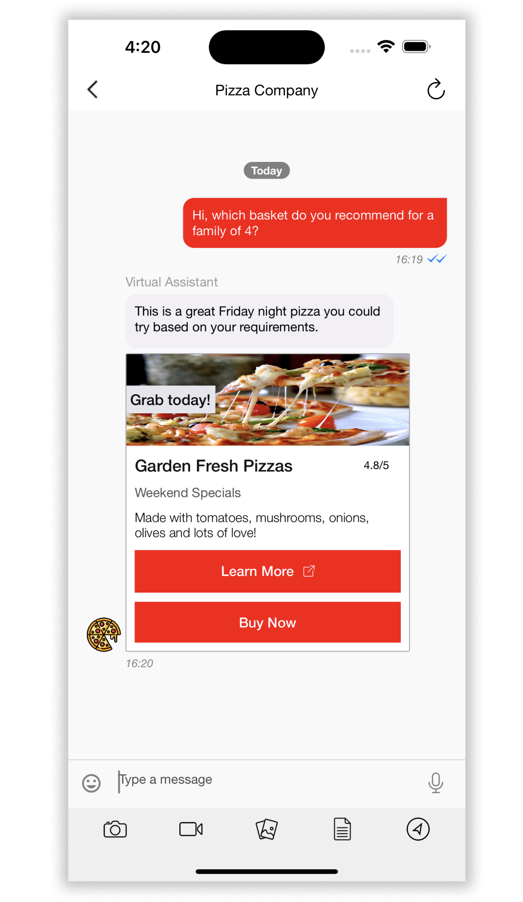
/// Use this to set the background of the card view.
KBMRichMessageStyles.KBMCardStyle.shared.backgroundColor = .white

/// Border width of card view.
KBMRichMessageStyles.KBMCardStyle.shared.borderWidth = 0

/// If borderWidth is not 0, set corner radius of the card
KBMRichMessageStyles.KBMCardStyle.shared.cornerRadius = 2

/// Border color of card view
KBMRichMessageStyles.KBMCardStyle.shared.borderColor = UIColor.lightGray.cgColor

// Title Style

/// Use this to set the padding of the subtitle label.
KBMRichMessageStyles.KBMCardStyle.shared.titleLabel.outerPadding = Padding(left: 10.0, right: 10.0, top: 10.0, bottom: 0.0)

let cardTitleLabelFont = UIFont.font(.medium(size: 18))
/// Use this to set the style of title.
KBMRichMessageStyles.KBMCardStyle.shared.titleLabel.textStyle = Style(font: UIFontMetrics(forTextStyle: .title3).scaledFont(for: cardTitleLabelFont),
                                                                                text: UIColor(red: 20, green: 19, blue: 19),
                                                                                defaultFontSize: 18,
                                                                                fontTextStyle: .title3,
                                                                                fontName: cardTitleLabelFont.fontName)
// Overlay label

/// Use this to set the padding of the overlay label
KBMRichMessageStyles.KBMCardStyle.shared.overlayLabel.padding = Padding(left: 5.0, right: 5.0, top: 5.0, bottom: 5.0)

let cardOverlayLabelFont = UIFont.font(.medium(size: 16))
/// Use this to set text style of overlay label
KBMRichMessageStyles.KBMCardStyle.shared.overlayLabel.textStyle = Style(font: UIFontMetrics(forTextStyle: .subheadline).scaledFont(for: cardOverlayLabelFont),
                                                                                  text: UIColor(red: 13, green: 13, blue: 14),
                                                                                  defaultFontSize: 16,
                                                                                  fontTextStyle: .subheadline,
                                                                                  fontName: cardOverlayLabelFont.fontName)

/// Use this to set the Text Alignment of the overlay label
KBMRichMessageStyles.KBMCardStyle.shared.overlayLabel.textAlignment = .natural

// Subtitle Style

/// Use this to set the padding of the subtitle label.
KBMRichMessageStyles.KBMCardStyle.shared.subtitleLabel.padding = Padding(left: 10.0, right: 10.0, top: 10.0, bottom: 0.0)

let cardSubtitleLabelFont = UIFont.font(.normal(size: 14))
/// Use this to set the style of subtitle.
KBMRichMessageStyles.KBMCardStyle.shared.subtitleLabel.textStyle = Style(font: UIFontMetrics(forTextStyle: .subheadline).scaledFont(for:cardSubtitleLabelFont),
                                                                                   text: UIColor(red: 86, green: 84, blue: 84),
                                                                                   defaultFontSize: 14,
                                                                                   fontTextStyle: .subheadline,
                                                                                   fontName: cardSubtitleLabelFont.fontName)
// Description Label Style

/// Use this to set the padding for description label.
KBMRichMessageStyles.KBMCardStyle.shared.descriptionLabel.padding = Padding(left: 10.0, right: 10.0, top: 10.0, bottom: 0.0)

let cardDescriptionLabelFont = UIFont.font(.light(size: 14))
/// Use this to set the style of descriptionLabel.
KBMRichMessageStyles.KBMCardStyle.shared.descriptionLabel.textStyle = Style(font: UIFontMetrics(forTextStyle: .body).scaledFont(for:cardDescriptionLabelFont),
                                                                                      text:.black,
                                                                                      defaultFontSize: 14,
                                                                                      fontTextStyle: .body,
                                                                                      fontName: cardDescriptionLabelFont.fontName)
// Action button styles

/// Spacing between the buttons.
KBMRichMessageStyles.KBMCardStyle.shared.actionButton.spacing = 10

/// Corner radius of button.
KBMRichMessageStyles.KBMCardStyle.shared.actionButton.cornerRadius = 0

/// Border width of button.
KBMRichMessageStyles.KBMCardStyle.shared.actionButton.borderWidth = 1

/// Use this to set the border color of button.
KBMRichMessageStyles.KBMCardStyle.shared.actionButton.borderColor = UIColor.red.cgColor

/// Outer padding of button views.
KBMRichMessageStyles.KBMCardStyle.shared.actionButton.outerPadding = Padding(left: 10.0, right: 10.0, top: 10.0, bottom: 10.0)

/// Inner padding for action button text.
KBMRichMessageStyles.KBMCardStyle.shared.actionButton.padding = Padding(left: 20.0, right: 20.0, top: 10.0, bottom: 10.0)

let cardButtonTextFont = UIFont.font(.medium(size: 15))
/// Use this to style action button text.
KBMRichMessageStyles.KBMCardStyle.shared.actionButton.textStyle = Style(font: UIFontMetrics(forTextStyle: .subheadline).scaledFont(for: cardButtonTextFont),
                                                                                 text: .red,
                                                                                 defaultFontSize: 15,
                                                                                 fontTextStyle: .subheadline,
                                                                                 fontName: cardButtonTextFont.fontName)

/// Use this for disabled button background color of view.
/// Requires SDK v 1.13.0 or above
KBMRichMessageStyles.KBMCardStyle.shared.actionButton.disabledBackgroundColor = .gray

/// Used for disabled button text style
/// Requires SDK v 1.13.0 or above
KBMRichMessageStyles.KBMCardStyle.shared.actionButton.disabledTextStyle = Style(font: UIFontMetrics(forTextStyle: .subheadline).scaledFont(for: cardButtonTextFont),
                                                                                          text: .red,
                                                                                          defaultFontSize: 15,
                                                                                          fontTextStyle: .subheadline,
                                                                                          fontName: cardButtonTextFont.fontName)
Add icon to link buttons in Card rich messages
/// Link button: Size of image.
/// Default size :  width 12 and height 12.
KBMRichMessageStyles.KBMCardStyle.shared.actionButton.imageSize = CGSize(width: 12, height: 12)

/// Link button: Space between image and text.
/// Default Spacing: 10
KBMRichMessageStyles.KBMCardStyle.shared.actionButton.textImageSpace = 10

/// Link button: If true, then it will ignore applying `textStyle` text color and will use the actual image color
KBMRichMessageStyles.KBMCardStyle.shared.actionButton.disableImageTintColor = false

/// Link button: use this to set your own Icon of link button which is right of text.
/// Default icon: Added from SDK which has icon name `link`
KBMRichMessageStyles.KBMCardStyle.shared.actionButton.linkIcon = UIImage(named: "link", in: Bundle(for: SuggestedReplyView.self), compatibleWith: nil)
Customizing icons on individual buttons
Customers can set each rich-message button's icon individually. For example, they can now inspect a url button's data, and set one icon if it is khoros.com or something else for elsewhere.
Button style can be implemented using protocol KBMRichButtonStyleDelegate and method getButtonStyle(buttonModel:).
Eg:
class AppDelegate: UIResponder, UIApplicationDelegate, UNUserNotificationCenterDelegate, KBMRichButtonStyleDelegate {

    func getButtonStyle(buttonModel: KBMButtonModel) -> KBMRichMessageButtonStyle {

        var richMessageButtonStyle = KBMRichMessageButtonStyle()
        // Common style config templates.
        richMessageButtonStyle.textAlignment = .center
        richMessageButtonStyle.padding = .init(left: 20, right: 20, top: 10, bottom: 10)
        richMessageButtonStyle.backgroundColor = .white
        richMessageButtonStyle.cornerRadius = 10
        richMessageButtonStyle.borderWidth = 1

        // Card button template style for templateId 10
        if buttonModel.templateId == "10" {
           let cardButtonTextFont = UIFont(name: "HelveticaNeue", size: CGFloat(15)) ?? UIFont.systemFont(ofSize: 15)

            // Card Link button style
            if buttonModel.type == .link {
                richMessageButtonStyle.borderColor = UIColor.red.cgColor
                richMessageButtonStyle.tintColor = .red

                if let url = buttonModel.url {
                    // Example for internal deep link icon config
                    if url.hasPrefix("myappscheme") {
                        richMessageButtonStyle.linkIcon = UIImage(named: "icon_arrow", in: Bundle(for: KBMConversationListViewController.self), compatibleWith: nil)
                    } else {
                        // For external link config
                        richMessageButtonStyle.linkIcon = UIImage(named: "link", in: Bundle.richMessageKit, compatibleWith: nil)
                    }
                }

            } else {
                // Normal button style without link

                richMessageButtonStyle.disabledTextStyle = Style(font: UIFontMetrics(forTextStyle: .subheadline).scaledFont(for: cardButtonTextFont),
                                                                    text: UIColor.blue,
                                                                    defaultFontSize: 15,
                                                                    fontTextStyle: .subheadline,
                                                                    fontName: cardButtonTextFont.fontName)

                richMessageButtonStyle.borderColor = UIColor.blue.cgColor
            }
            richMessageButtonStyle.textStyle = Style(font: UIFontMetrics(forTextStyle: .subheadline).scaledFont(for: cardButtonTextFont),
                                                        text: UIColor.blue,
                                                        defaultFontSize: 15,
                                                        fontTextStyle: .subheadline,
                                                        fontName: cardButtonTextFont.fontName)
        } else {
            // SUGGESTED REPLIES or LINK BUTTON  style for templateId 6, 3
            let buttonTextFont = UIFont(name: "HelveticaNeue", size: CGFloat(15)) ?? UIFont.systemFont(ofSize: 15)

            richMessageButtonStyle.textStyle = Style(font: UIFontMetrics(forTextStyle: .subheadline).scaledFont(for: buttonTextFont),
                                                        text: UIColor.blue,
                                                        defaultFontSize: 14,
                                                        fontTextStyle: .subheadline,
                                                        fontName: buttonTextFont.fontName)
            if buttonModel.type == .link {

                richMessageButtonStyle.borderColor = UIColor.blue.cgColor
                richMessageButtonStyle.tintColor = .blue

                if let url = buttonModel.url {
                    // Example for internal deep link icon config
                    if url.hasPrefix("myappscheme") {
                        richMessageButtonStyle.linkIcon = UIImage(named: "icon_arrow", in: Bundle(for: KBMConversationListViewController.self), compatibleWith: nil)
                    } else {
                        // For external link config
                        richMessageButtonStyle.linkIcon = UIImage(named: "link", in: Bundle.richMessageKit, compatibleWith: nil)
                    }
                }

            } else {
                // Normal button  style without link
                richMessageButtonStyle.borderColor = UIColor.blue.cgColor
            }
        }
        return richMessageButtonStyle
    }

    func application(_ application: UIApplication, didFinishLaunchingWithOptions launchOptions: [UIApplication.LaunchOptionsKey: Any]?) -> Bool {
         // Set the delegate the rich message button delegate using the below code :
          BrandMessengerManager.setRichMessageButtonStyleDelegate(self)
         return true
  }
}
Citations
Rich messages can contain citations info, displayed beneath the rich message
To customise citation container when citation is showing below message text.
KBMRichMessageStyles.KBMCitationStyle.shared.backgroundColor = UIColor(hexString: "#F2F0F5")
KBMRichMessageStyles.KBMCitationStyle.shared.citationDivider.dividerHeight = 1
KBMRichMessageStyles.KBMCitationStyle.shared.citationDivider.backgroundColor = UIColor.gray
KBMRichMessageStyles.KBMCitationStyle.shared.citationDivider.opacity = 0.2
To customise citation link text and header text font, color when citation showing below message text
KBMRichMessageStyles.KBMCitationStyle.shared.citationLinkTextStyle = Style(
    font: UIFontMetrics(forTextStyle: .subheadline)
        .scaledFont(for: UIFont(name: "HelveticaNeue", size: CGFloat(14))
                    ?? UIFont.systemFont(ofSize: 14)),
    text: UIColor(hexString: "#717171"),
    defaultFontSize: 14,
    fontTextStyle: .subheadline,
    fontName: "HelveticaNeue"
)
KBMRichMessageStyles.KBMCitationStyle.shared.citationHeaderTextStyle = Style(
    font: UIFontMetrics(forTextStyle: .subheadline)
        .scaledFont(for: UIFont(name: "HelveticaNeue", size: CGFloat(14))
                    ?? UIFont.systemFont(ofSize: 14)),
    text: UIColor(hexString: "#717171"),
    defaultFontSize: 14,
    fontTextStyle: .subheadline,
    fontName: "HelveticaNeue"
)
To customise citation container when citation is showing in single card.
KBMRichMessageStyles.KBMCardStyle.shared.cardCitationStyle.backgroundColor = UIColor(hexString: "#F2F0F5")
KBMRichMessageStyles.KBMCardStyle.shared.cardCitationStyle.citationDivider.dividerHeight = 1
KBMRichMessageStyles.KBMCardStyle.shared.cardCitationStyle.citationDivider.backgroundColor = UIColor.gray
KBMRichMessageStyles.KBMCardStyle.shared.cardCitationStyle.citationDivider.opacity = 0.2
To customise citation link text and header text font, color when citation is showing in single card.
KBMRichMessageStyles.KBMCardStyle.shared.cardCitationStyle.citationLinkTextStyle = Style(
    font: UIFontMetrics(forTextStyle: .subheadline)
        .scaledFont(for: UIFont(name: "HelveticaNeue", size: CGFloat(14))
                    ?? UIFont.systemFont(ofSize: 14)),
    text: UIColor(hexString: "#717171"),
    defaultFontSize: 14,
    fontTextStyle: .subheadline,
    fontName: "HelveticaNeue"
)
KBMRichMessageStyles.KBMCardStyle.shared.cardCitationStyle.citationHeaderTextStyle = Style(
    font: UIFontMetrics(forTextStyle: .subheadline)
        .scaledFont(for: UIFont(name: "HelveticaNeue", size: CGFloat(14))
                    ?? UIFont.systemFont(ofSize: 14)),
    text: UIColor(hexString: "#717171"),
    defaultFontSize: 14,
    fontTextStyle: .subheadline,
    fontName: "HelveticaNeue"
)
Location sharing
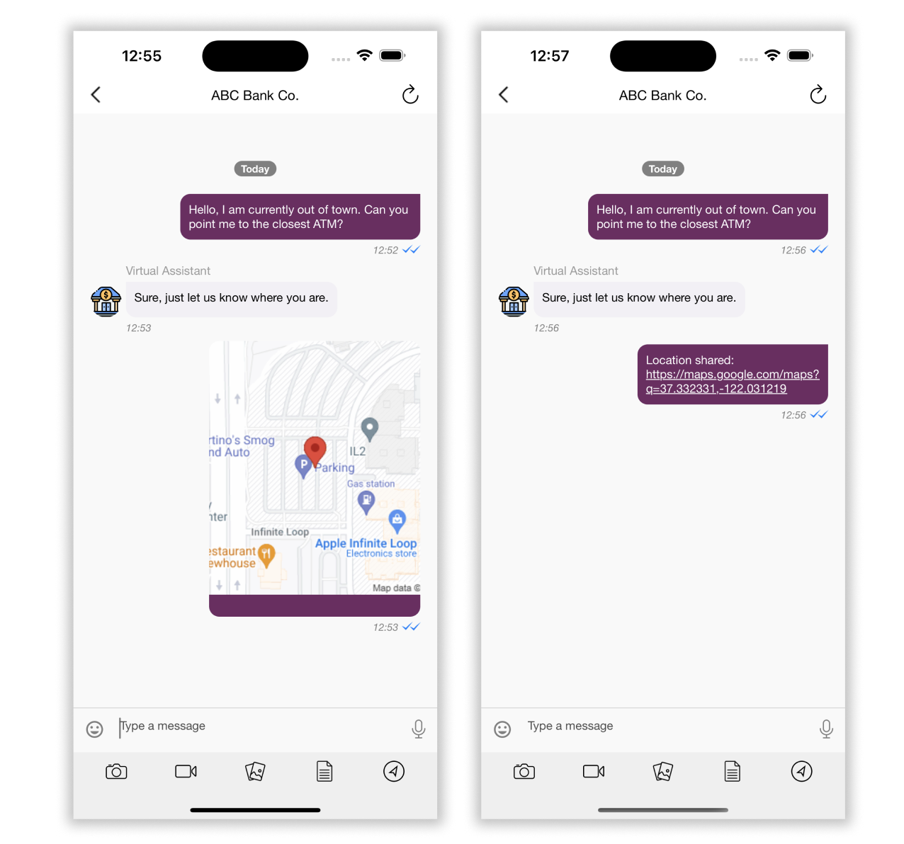
You can enable using the below configuration :
var config = KBMConfiguration()


    // If false, then the location will be shared as a link in chat.

    // Default value is true it will be shared as a map view in chat.
    config.locationShareViaMap = false
BrandMessengerManager.setDefaultConfiguration(config)
To share location via map, make sure you have added Google map API key like so :
KBMUserDefaultsHandler.setGoogleMapAPIKey("your-key")
Chat Bar
You can customize several of the chat bar options.
Chat Bar Bottom View color
To change Chat Bar's bottom view color, edit the chatBarAttachmentViewBackgroundColor value, shown below.
This view contains all the attachments and other options.
DEFAULT: UIColor.background(.grayEF)
config.chatBarAttachmentViewBackgroundColor = UIColor.lightGray
Attachment Buttons
You can choose to show or hide the 6 attachment-related buttons (contact, camera, document, gallery, video, location).
By default, camera, gallery, and document are visible. To hide all the attachment options, add the setting below.
//To hide all options in attachment
config.chatBar.optionsToShow = .none

// If you want to show just two attachment options:
config.chatBar.optionsToShow = .some([.camera, .location])

// If you want to show all attachment options then use this:
config.chatBar.optionsToShow = .all
Mic Button
You can choose to show or hide the microphone button in the Chat Bar.
If true, then mic button is hidden.
If false, then mic button is visible.
DEFAULT: false
config.hideAudioOptionInChatBar = true
Line between Send button and textView
To change visibility of line between Send button and textView in Chat Bar, edit the hideLineImageFromChatBar value.
If true, the line between Send button and text view is hidden.
If false, the line between Send button and text view is visible.
DEFAULT: false
config.hideLineImageFromChatBar = true
Send button
Some elements of the 'Send' text button can be customized via the KBMConfiguration class
var config = KBMConfiguration()
let sentButtonTextFont = UIFont.systemFont(ofSize: 16)
config.chatBar.messageInputViewStyle.sendButton = ButtonStyle(font: sentButtonTextFont,
                                                                      titleColor: .green,
                                                                      titleColorDisabled: .lightGray,
                                                                      titleColorHighlighted: .blue,
                                                                      background: .brown,
                                                                      title: "BUTTON",
                                                                      defaultFontSize: 16,
                                                                      fontTextStyle: .body,
                                                                      fontName: sentButtonTextFont.fontName)
BrandMessengerManager.setDefaultConfiguration(config)
Message Input Area
The text-input area background and text fonts can be customized via KBMConfiguration
var config = KBMConfiguration()

config.chatBar.messageInputViewStyle.backgroundColor = .white
let messageInputTextFont = UIFont.systemFont(ofSize: 15)
config.chatBar.messageInputViewStyle.textView = Style(font: messageInputTextFont, text: .red, defaultFontSize: 15, fontTextStyle: .body, fontName: messageInputTextFont.fontName)
/// NOTE: Keep the font size of `placeholder` to match with `messageInputViewStyle.textView`
config.chatBar.messageInputViewStyle.placeholder = Style(font: messageInputTextFont, text: .red, defaultFontSize: 15, fontTextStyle: .body, fontName: messageInputTextFont.fontName)
/// Message input cursor color you can set using below code.
/// Requires SDK v 1.14.0 or above
config.chatBar.messageInputViewStyle.cursorColor = .red

BrandMessengerManager.setDefaultConfiguration(config)
Line Above Chatbar
The line above chat-bar can be hidden via KBMConfiguration
var config = KBMConfiguration()

config.chatBar.hideAboveLineView = true

BrandMessengerManager.setDefaultConfiguration(config)
Typing Indicator
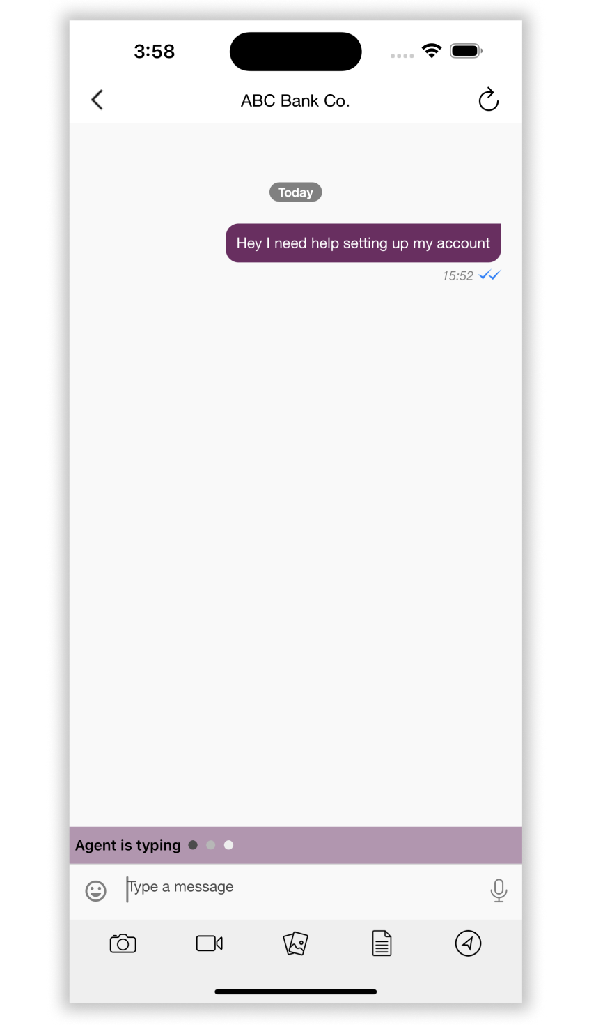
The typing-indicator animation displayed when Agent is typing can be customized by setting your own dot view color via KBMConfiguration.
var config = KBMConfiguration()

// Dots Animation duration in TimeInterval seconds.
config.chatBar.typingViewStyle.animationDuration = 1.2
// Made Dots view background color now. Before it was typing-view background color.
config.chatBar.typingViewStyle.backgroundColor = .black

BrandMessengerManager.setDefaultConfiguration(config)
System Messages
Scrollable System Message
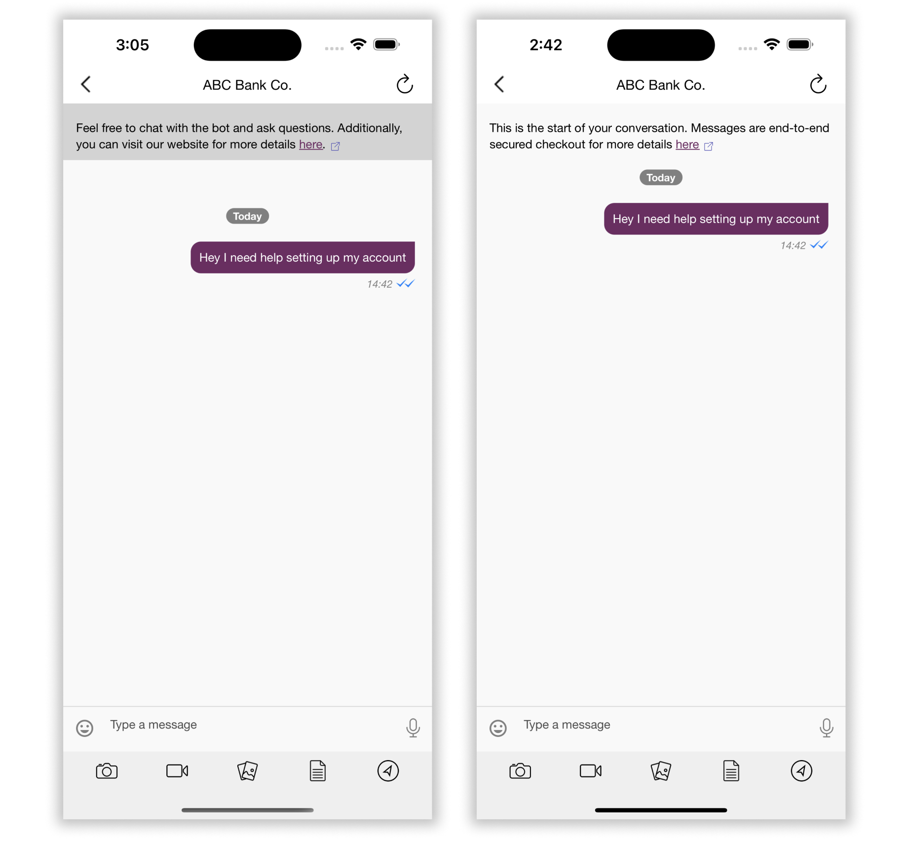
In your custom Localizable.strings file, you can update the system message at the top of conversation screen, for text such as privacy policy and terms and conditions. This message scrolls with the page and will be at the top of the conversation.
com.kbm.StartOfConversation = "This is the start of the conversation. Click here";
com.kbm.LinkText = "Click here";
com.kbm.LinkValue = "https://www.google.com";
The com.kbm.LinkText substring will be replaced with an interactive element that will open com.kbm.LinkValue url in an external browser.
To customize the color and style of the system message:
 var config = KBMConfiguration()
 /// Set text color of header text
 config.headerViewConfiguration.textColor = UIColor.brown
 /// Set padding to header text
 config.headerViewConfiguration.padding = UIEdgeInsets(top: 12, left: 10, bottom: 0, right: 12)
 /// Set line spacing between header text lines
 config.headerViewConfiguration.lineSpacing = 2.0
 /// Set paragraph spacing between header
 config.headerViewConfiguration.paragraphSpacing = 7.0
 let headerViewTextFont = UIFont.font(.normal(size:12))
 /// Set text style to header text
 config.headerViewConfiguration.textStyle = Style( font: UIFontMetrics(forTextStyle: .footnote).scaledFont(for: headerViewTextFont),
                                                             text: .text(.black00),
                                                             defaultFontSize: 12,
                                                             fontTextStyle: .footnote,
                                                             fontName: headerViewTextFont.fontName)
 /// Set text color to link text
 config.headerViewConfiguration.linkTextColor = UIColor.red
 /// Set color of underline of link text
 config.headerViewConfiguration.linkUnderlineColor = UIColor.red
 /// Set custom icon to header
 config.headerViewConfiguration.headerIcon = UIImage(named: "<your-image>")
 /// Set width to custom icon
 config.headerViewConfiguration.iconWidth = 10
 /// Set height to custom icon
 config.headerViewConfiguration.iconHeight = 10
 BrandMessengerManager.setDefaultConfiguration(config)
Pinned System Message
In your code, you can update the pinned system message at the top of conversation screen, for text such as privacy policy and terms and conditions. This message is pinned and does not scroll even when the conversation is scroll, and is always visible to the user.
First, to enable showing of this pinned system message, set hidePinnedSystemMessageHeader in config to false. The styling can be updated like so:
var config = KBMConfiguration()
/// Set whether to hide or display pinned header, default is true, here set to false
config.hidePinnedSystemMessageHeader = false
/// Set customicon to header
config.pinnedHeaderConfig.pinnedSystemMessageIcon = UIImage(named: "<your-image-name>")
/// Set text color to header text
config.pinnedHeaderConfig.textColor = .black
/// Set padding to header text
config.pinnedHeaderConfig.padding = UIEdgeInsets(top: 0, left: 0, bottom: 0, right: 0)
/// Set line spacing between header text lines
config.pinnedHeaderConfig.lineSpacing = 2.0
/// Set paragraph spacing
config.pinnedHeaderConfig.paragraphSpacing = 7.0
let pinnedHeaderTextFont = UIFont.font(.normal(size:12))
/// Set text style to header text
config.pinnedHeaderConfig.textStyle = Style(font: UIFontMetrics(forTextStyle: .footnote).scaledFont(for: pinnedHeaderTextFont),
                                                  text: .text(.white),
                                                  defaultFontSize: 12,
                                                  fontTextStyle: .footnote,
                                                  fontName: pinnedHeaderTextFont.fontName)
/// Set icon width to custom icon
config.pinnedHeaderConfig.iconWidth = 10.0
/// Set icon height to custom icon
config.pinnedHeaderConfig.iconHeight = 10.0
/// Set text color to link text
config.pinnedHeaderConfig.linkTextColor = .red
/// Set color to underline of link text
config.pinnedHeaderConfig.linkUnderlineColor = .brown
BrandMessengerManager.setDefaultConfiguration(config)
As with system header, the pinned system header's text and link can be customized in Localizable.strings file.
com.kbm.PinnedSystemMessageText = "Welcome, click the link to go to www.khoros.com";
com.kbm.PinnedLinkText = "www.khoros.com";
com.kbm.PinnedLinkValue = "https://www.khoros.com";
In-Conversation System Message
System messages are notifications displayed at the center of the chat screen. They include types like information, success, warning, danger, and message.
Use to customize look and feel of each system message type font, colors, icon size and view padding:
// Size of icon
KBMRichMessageStyles.KBMSystemMessageStyleType.shared.notificationIconDimensions.height = 20
KBMRichMessageStyles.KBMSystemMessageStyleType.shared.notificationIconDimensions.width = 20
// Padding for containerView and messageTextView
KBMRichMessageStyles.KBMSystemMessageStyleType.shared.notificationIconDimensions.leftPadding = 10
KBMRichMessageStyles.KBMSystemMessageStyleType.shared.containerViewPadding = .init(left: 52, right: 52, top: 5, bottom: 5)
KBMRichMessageStyles.KBMSystemMessageStyleType.shared.messageTextViewPadding = .init(left: 10, right: 10, top: 5, bottom: 5)

// Style for information notification message
KBMRichMessageStyles.KBMSystemMessageStyleType.shared.notificationInfo.backgroundColor = UIColor(hexString: "#209CDF")
KBMRichMessageStyles.KBMSystemMessageStyleType.shared.notificationInfo.cornerRadius = 12
KBMRichMessageStyles.KBMSystemMessageStyleType.shared.notificationInfo.textStyle = Style(
    font: UIFontMetrics(forTextStyle: .subheadline).scaledFont(for: UIFont.font(.medium(size: 12))),
    text: UIColor.white,
    defaultFontSize: 12,
    fontTextStyle: .subheadline,
    fontName: UIFont.font(.normal(size: 12)).fontName
)
KBMRichMessageStyles.KBMSystemMessageStyleType.shared.notificationInfo.icon = UIImage(
    named: "info_circle",
    in: Bundle(for: KBMConversationListViewController.self),
    compatibleWith: nil
)
// Style for success notification message
KBMRichMessageStyles.KBMSystemMessageStyleType.shared.notificationSuccess.backgroundColor = UIColor(hexString: "#00A39E")
KBMRichMessageStyles.KBMSystemMessageStyleType.shared.notificationSuccess.cornerRadius = 12
KBMRichMessageStyles.KBMSystemMessageStyleType.shared.notificationSuccess.textStyle = Style(
    font: UIFontMetrics(forTextStyle: .subheadline).scaledFont(for: UIFont.font(.medium(size: 12))),
    text: UIColor.white,
    defaultFontSize: 12,
    fontTextStyle: .subheadline,
    fontName: UIFont.font(.normal(size: 12)).fontName
)
KBMRichMessageStyles.KBMSystemMessageStyleType.shared.notificationSuccess.icon = UIImage(
    named: "info_circle",
    in: Bundle(for: KBMConversationListViewController.self),
    compatibleWith: nil
)
// Style for warning notification message
KBMRichMessageStyles.KBMSystemMessageStyleType.shared.notificationWarning.backgroundColor = UIColor(hexString: "#E9700C")
KBMRichMessageStyles.KBMSystemMessageStyleType.shared.notificationWarning.cornerRadius = 12
KBMRichMessageStyles.KBMSystemMessageStyleType.shared.notificationWarning.textStyle = Style(
    font: UIFontMetrics(forTextStyle: .subheadline).scaledFont(for: UIFont.font(.medium(size: 12))),
    text: UIColor.white,
    defaultFontSize: 12,
    fontTextStyle: .subheadline,
    fontName: UIFont.font(.normal(size: 12)).fontName
)
KBMRichMessageStyles.KBMSystemMessageStyleType.shared.notificationWarning.icon = UIImage(
    named: "info_circle",
    in: Bundle(for: KBMConversationListViewController.self),
    compatibleWith: nil
)
// Style for danger notification message
KBMRichMessageStyles.KBMSystemMessageStyleType.shared.notificationDanger.backgroundColor = UIColor(hexString: "#DC365B")
KBMRichMessageStyles.KBMSystemMessageStyleType.shared.notificationDanger.cornerRadius = 12
KBMRichMessageStyles.KBMSystemMessageStyleType.shared.notificationDanger.textStyle = Style(
    font: UIFontMetrics(forTextStyle: .subheadline).scaledFont(for: UIFont.font(.medium(size: 12))),
    text: UIColor.white,
    defaultFontSize: 12,
    fontTextStyle: .subheadline,
    fontName: UIFont.font(.normal(size: 12)).fontName
)
KBMRichMessageStyles.KBMSystemMessageStyleType.shared.notificationDanger.icon = UIImage(
    named: "info_circle",
    in: Bundle(for: KBMConversationListViewController.self),
    compatibleWith: nil
)
// Style for message
KBMRichMessageStyles.KBMSystemMessageStyleType.shared.notificationMessage.backgroundColor = UIColor.clear
KBMRichMessageStyles.KBMSystemMessageStyleType.shared.notificationMessage.cornerRadius = 12
KBMRichMessageStyles.KBMSystemMessageStyleType.shared.notificationMessage.textStyle = Style(
    font: UIFontMetrics(forTextStyle: .subheadline).scaledFont(for: UIFont.font(.bold(size: 12))),
    text: UIColor.darkTextColor(),
    defaultFontSize: 12,
    fontTextStyle: .subheadline,
    fontName: UIFont.font(.bold(size: 12)).fontName
)
To customise voice over readout for system messages, add this in Localizable.strings:
com.kbm.SystemNotificationInformationAccessibilityText = "Notification Information, %@";
com.kbm.SystemNotificationSuccessAccessibilityText = "Notification Success, %@";
com.kbm.SystemNotificationWarningAccessibilityText = "Notification Warning, %@";
com.kbm.SystemNotificationDangerAccessibilityText = "Notification Danger, %@";
com.kbm.SystemNotificationMessageAccessibilityText = "Notification Message, %@";
BrandMessenger Localization
You can localize the strings used in BrandMessenger SDK by creating localizable strings file with all the translated keys. For more information, refer to the BrandMessenger Localization section.
If you are creating localizable file with a custom name, you must pass the file name here.
DEFAULT: Localizable
config.localizedStringFileName = "YOUR_FILE_NAME"
From v1.7.0, all BrandMessenger's customizable localized string names are prefixed with com.kbm..
Navigation Bar Title
com.kbm.ProfileName = "Conversation screen title";
Message Timestamp
Each message's timestamp dateformatter can be customized.
com.kbm.MessageTimestampDateFormat = "h:mm a"
com.kbm.MessageTimestampAMSymbol = "am"
com.kbm.MessageTimestampPMSymbol = "pm"
All customizable localizable strings
com.kbm.Back = "Back";
com.kbm.ChatHere = "Type a message";
com.kbm.ButtonCancel = "Cancel";
com.kbm.CamNotAvaiable = "Unable to start your camera";
com.kbm.LocationNotAvaiable = "Unable to share your location";
com.kbm.PleaseAllowCamera = "Please change Settings to allow to access your camera";
com.kbm.PleaseAllowLocation = "Please change Settings to allow to access your location";
com.kbm.UnspecifiedLocation = "Unspecified Location";
com.kbm.PhotoAlbumSuccessTitle = "Done";
com.kbm.PhotoAlbumSuccess = "Photo saved";
com.kbm.PhotoAlbumOk = "Ok";
com.kbm.PhotoAlbumFailureTitle = "Error";
com.kbm.PhotoAlbumFail = "Save failed";
com.kbm.DownloadOriginalImageFail = "Fail to download the original image";
com.kbm.IsTypingForRTL = "typing is %@";

// Storyboard
com.kbm.DoneButton = "Done";
com.kbm.Camera = "Camera";
com.kbm.SelectButton = "Select";
com.kbm.SendPhoto = "Send Photo";
com.kbm.PhotosTitle = "Photos";
com.kbm.CameraNotAvailableMessage = "Camera is not Available !!!";
com.kbm.GalleryNotAvailableMessage = "Gallery is not available";
com.kbm.CameraNotAvailableTitle = "OOPS !!!";
com.kbm.ShareLocationTitle = "Share Location";
com.kbm.SendLocationButton = "Send Location";

com.kbm.RecordingMessage = "Recording";
com.kbm.MicrophoneNotAvailableMessage = "Microphone is not available";
com.kbm.AllowSoundRecordingMessage = "Please change Settings to allow sound recording";
com.kbm.SlideToCancelMessage = "Slide to cancel";

com.kbm.EnableCameraPermissionMessage = "Enable Camera Permission";
com.kbm.Settings = "Settings";
com.kbm.Cancel = "Cancel";
com.kbm.SendVideo = "Send Video";
com.kbm.IsTyping = "%@ is typing";
com.kbm.TypingStatusDefaultPrefixName = "Agent";
com.kbm.Copy = "Copy";
com.kbm.Reply = "Reply";
com.kbm.You = "You";

com.kbm.ConfirmButton = "Confirm";
com.kbm.LoadingIndicatorText = "Loading...";
com.kbm.LocationSharingLoadingText = "Please wait while requesting the location";
com.kbm.OkMessage = "Ok";
com.kbm.VideoExportError = "Some error occured while exporting files";
com.kbm.NetworkAccessFailedMessage = "No internet access";
com.kbm.OkayMessage = "OKAY";
com.kbm.ReplyInfoMessage = "We are unable to directly retrieve this message for you. You can still scroll up your messages and view it.";
com.kbm.FailedToLoadLink = "Failed to load a link";
com.kbm.ExportLoadingIndicatorText = "Exporting...";
com.kbm.RichMessageImagePreviewTitle = "Image";

// set up a title for conversation screen
com.kbm.ProfileName = "";

// table header view text
com.kbm.StartOfConversation = "";
com.kbm.LinkText = "";
com.kbm.LinkValue = "";

// Pinned header view text
com.kbm.PinnedSystemMessageText = "";
com.kbm.PinnedLinkText = "";
com.kbm.PinnedLinkValue = "";

// Accessibility Button label names
com.kbm.BackButtonAccessibilityLabelName = "back";
com.kbm.ContactButtonAccessibilityLabelName = "contact";
com.kbm.CameraButtonAccessibilityLabelName = "camera";
com.kbm.VideoButtonAccessibilityLabelName = "video";
com.kbm.VoiceButtonAccessibilityLabelName = "voice message button";
com.kbm.GalleryButtonAccessibilityLabelName = "gallery";
com.kbm.LocationButtonAccessibilityLabelName = "location";
com.kbm.DocumentButtonAccessibilityLabelName = "document";
com.kbm.WebViewCloseButtonAccessibilityLabelName = "close";

// Accessibility Button label values
com.kbm.VoiceButtonAccessibilityValue = "Double tap and hold to record, release to send";

// a11y message labels
com.kbm.Delivered = "delivered to recipient";
com.kbm.Read = "read by recipient";
com.kbm.Sent = "sent to recipient";
com.kbm.Pending = "pending";
com.kbm.ReceivedMessageText = "Messsage %@ by %@ at %@";
com.kbm.SentMessageText = "Your message %@ at %@, %@";
com.kbm.ReceivedMessageLinks = "Link %@ by %@ at %@";
com.kbm.SentMessageLinks = "Your link %@ at %@, %@";
com.kbm.ReceivedMessageImage = "Image by %@ at %@";
com.kbm.SentMessageImage = "Your image at %@, %@";
com.kbm.ReceivedMessageVoice = "Voice message by %@ at %@";
com.kbm.SentMessageVoice = "Your voice message at %@, %@";
com.kbm.ReceivedMessageLocation = "Location by %@ at %@";
com.kbm.SentMessageLocation = "Your location at %@, %@";
com.kbm.ReceivedMessageVideo = "Video by %@ at %@";
com.kbm.SentMessageVideo = "Your video at %@, %@";
// Cards voice over readout
com.kbm.ReceivedMessageCards = "Cards %@ by %@ at %@";
com.kbm.SentMessageCards = "Your cards %@ at %@, %@";

// Suggested replies button voice over readout
com.kbm.ReceivedMessageQuickReply = "Suggested replies %@ by %@ at %@";
com.kbm.SentMessageQuickReply = "Your suggested replies %@ at %@, %@";

// Link button voice over readout
com.kbm.ReceivedMessageButton = "Button %@ by %@ at %@";
com.kbm.SentMessageButton = "Your button %@ at %@, %@";
com.kbm.ReceivedMessageDocument = "Document by %@ at %@";
com.kbm.SentMessageDocument = "Your document at %@, %@";
com.kbm.ReceivedMessageContact = "Contact by %@ at %@";
com.kbm.SentMessageContact = "Your contact at %@, %@";
com.kbm.ReceivedMessageImageWithCaption = "Image with caption: %@, by %@ at %@";
com.kbm.SentMessageImageWithCaption = "Your image with caption: %@ at %@, %@";
com.kbm.ReceivedMessageButtons = "Buttons by %@ at %@";
com.kbm.SentMessageButtons = "Your buttons at %@, %@";
com.kbm.SaveContact = "Double tap to save contact";
com.kbm.Download = "Double tap to download";
com.kbm.Location = "Location latitude %f, longitude %f";
com.kbm.Upload = "Double tap to upload";
com.kbm.FileSize = "File size is %@";
com.kbm.Play = "Double tap to play";
com.kbm.ReceivedNewMessageAnnouncementAccessibility = "New message arrived.";
com.kbm.OpenViewAccessibilityName = "Double tap to open";

// A11y Messages Container
com.kbm.ConversationVCMessagesContainerAccessibilityName = "Messages";

// A11y Message status
com.kbm.MessageSentAnnouncementAccessibility = "Message sent.";
com.kbm.MessagePendingAnnouncementAccessibility = "Message pending.";

// A11y Messages loading
com.kbm.MessagesLoadingAccessibilityName = "Loading, please wait";

// A11y Typing Indicator Announcement
com.kbm.TypingIndicatorAccessibilityName = "Typing";

// A11y Send button active and inactive
com.kbm.SendButtonAccessibilityLabelName = "Send, Button";
com.kbm.SendButtonDisabledAccessibilityLabelName = "Send, Button, disabled";

// A11y Rich message Link button
com.kbm.OpensInExternalBrowserAccessibilityText = "Link, Opens in external browser";

// A11y Conversation or pinned header A11y
com.kbm.LinksOpensInExternalBrowserAccessibilityText = "Links open in external browser.";

com.kbm.UnselectedButtonAccessibility = "unselected";
com.kbm.SelectedButtonAccessibility = "selected";
// For header logo
com.kbm.BusinessLogoAccessibility = "Logo";

// Gallery photo or video select
com.kbm.GalleryVideoAccessibility = "Video";
com.kbm.GalleryPhotoAccessibility = "Photo";

// File uploading not allowed Alert
com.kbm.FileNotAllowedAlertTitle = "Not allowed";
com.kbm.FileNotAllowedAlertMessage = "Uploading this file not allowed";
Chat screen
Background Color
Use the color hex code to change the background color of the Chat Detail screen.
DEFAULT: Color hex : : 0xf9f9f9
config.backgroundColor = UIColor.red
Date-section Separator
The conversation screen's date-section separator time's dateformatter can be customized.
com.kbm.DateSectionHeaderDateFormat = "dd MM yyyy, h:mma";
com.kbm.DateSectionHeaderAMSymbol = "am"
com.kbm.DateSectionHeaderPMSymbol = "pm"
Date Separator cell
To customize the font, text color, and background color for the Date Separator cell, edit the values listed below.
DEFAULT BACKGROUND COLOR: UIColor.gray
DEFAULT TEXT COLOR: UIColor.white
let dateSeparatorFont = UIFont.font(.bold(size: 12))
KBMMessageStyle.dateSeparator = Style(
   font: UIFontMetrics(forTextStyle: .footnote).scaledFont(for: dateSeparatorFont),
            text: UIColor.gray,
            defaultFontSize: 12,
            fontTextStyle: .footnote,
            fontName: dateSeparatorFont.fontName
)
Add metadata while sending messages
To add additional information (specific metadata) whenever a message is sent, edit the messageMetadata value.
This information is passed in message's metadata field.
var messageMetadata = [AnyHashable : Any]()
messageMetadata["customKey"] = "customValue"
config.messageMetadata = messageMetadata
Disable Rich Message action
To enable or disable the click action on all rich messages, edit the disableRichMessageButtonAction value.
If true, the action is disabled.
If false, the action is enabled.
DEFAULT: false
config.disableRichMessageButtonAction = true
Disable In-App Notifications
To disable all in-app message notifications, edit the isInAppNotificationBannerDisabled value.
Note: Be sure to set this in the AppDelegate and pass the same configuration to all BrandMessenger APIs.
config.isInAppNotificationBannerDisabled = true
Enable Link Preview
To enable link preview in the chat for all the URLs, edit the isLinkPreviewDisabled value:
config.isLinkPreviewDisabled = false
You can add specific websites to your allowlist in the Info.plist file:
<key>NSAppTransportSecurity</key>
<dict>
  <key>NSAllowsArbitraryLoads</key>
  <false/>
  <key>NSExceptionDomains</key>
  <dict>
    <key>google.com</key>
    <dict>
      <key>NSIncludesSubdomains</key>
      <true/>
      <key>NSExceptionAllowsInsecureHTTPLoads</key>
      <true/>
    </dict>
  </dict>
</dict>
Read more about NSExceptionDomains here
Restricting message content
User's outgoing message content can be restricted by using a regex pattern. This can be utilized for purposes such as restricting sending profanity in messages.
To enable message content restriction, add restrictedMessageRegexPattern to default configurations and initializing the SDK.
var config = KBMConfiguration()
config.restrictedMessageRegexPattern = "^example$"
BrandMessengerManager.setDefaultConfiguration(config)
Update the following customizable string resources to customize the message presented to the user when an outgoing message is restricted.
com.kbm.profaneWordsTitle = "Profane Words";
com.kbm.profaneWordsMessage = "Please avoid using profane words.";
Markdown
To disable markdown at SDK level config, use the below config.
var config = KBMConfiguration()
// ...
// Other configurations can be added here
config.isMarkdownEnabled = false
BrandMessengerManager.setDefaultConfiguration(config)
Updated 12 months ago