Advanced CSS Classes
Learn about different CSS classes you can use to customize your Brand Messenger widget
You can utilize CSS classes to customize the look and feel of your Brand Messenger widget. In this guide, we will list the various elements and objects you can target within Brand Messenger's widget.
Chat Bubble
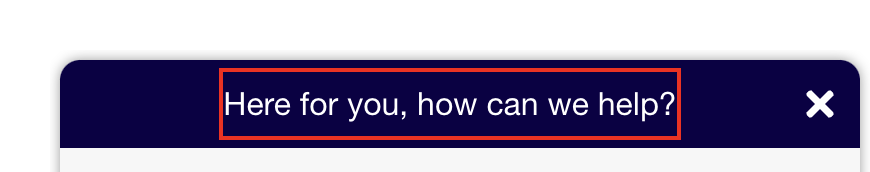
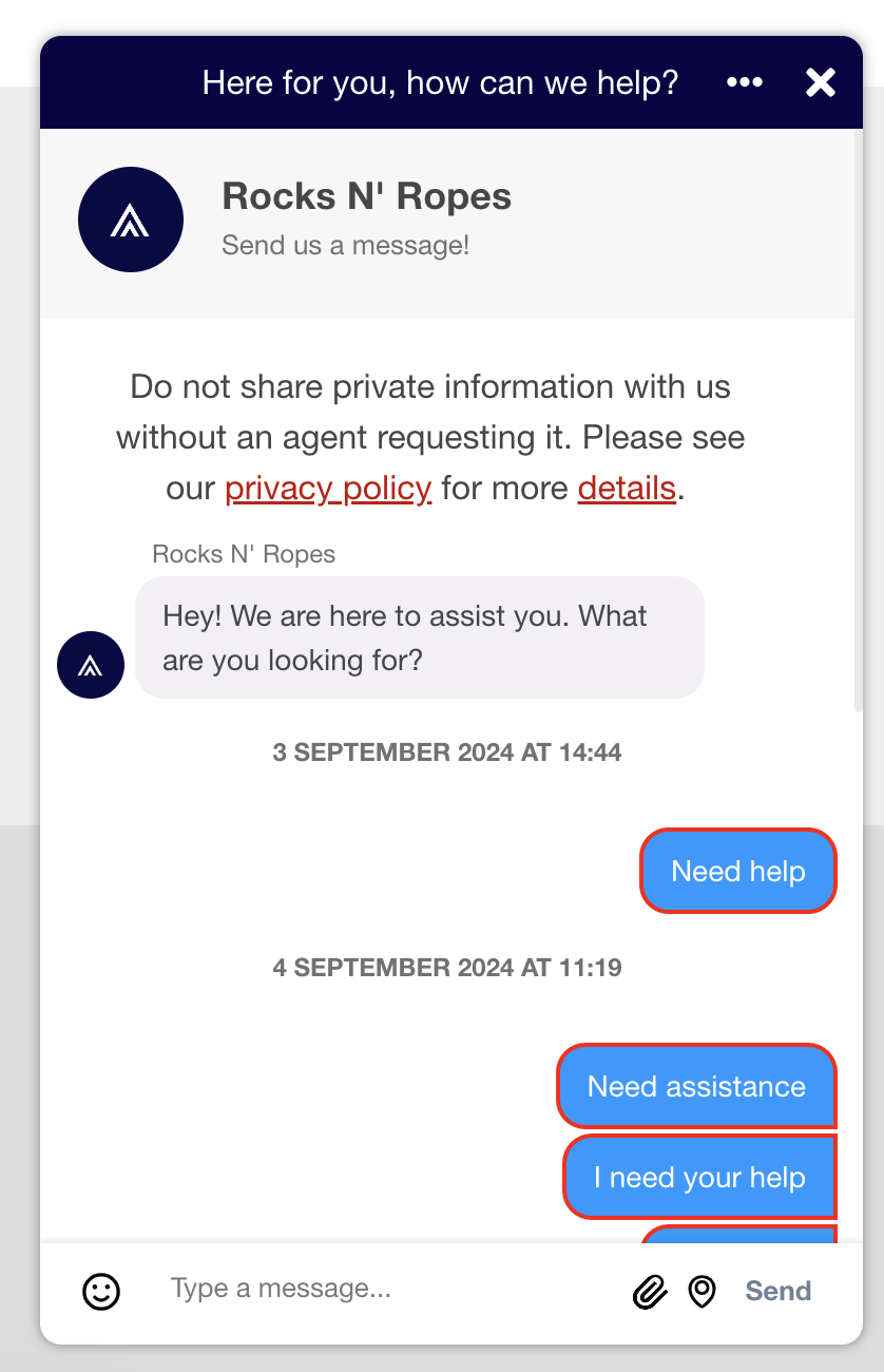
khWidgetButton
The button which appears first on the page, prompting the user that a chat experience is available. Selecting it initiates the Brand Messenger conversation.
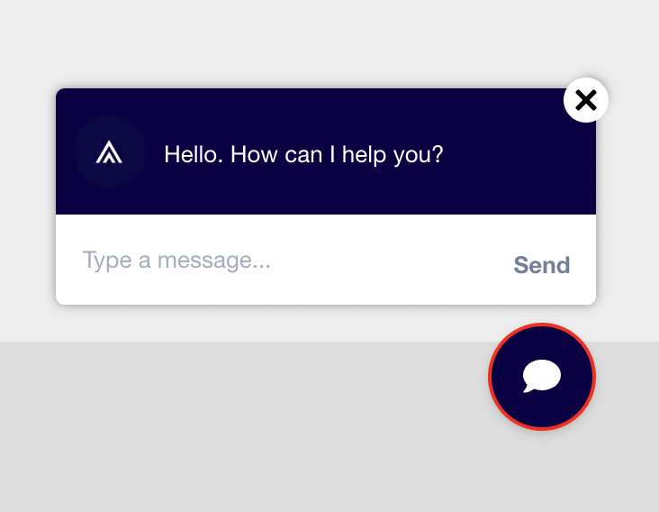
.khWidgetButton {
    border: 5px solid red;
}
khChatWindowHeader / header
This is the tab-style button, prompting the user that a chat experience is available.
#header.khChatWindowHeader {
    border: 5px solid red;
}
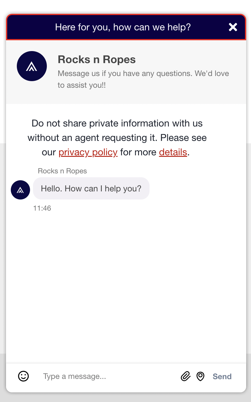
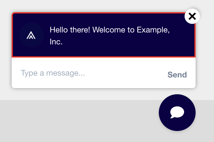
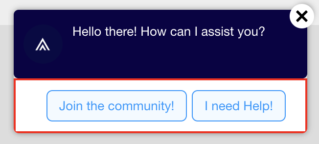
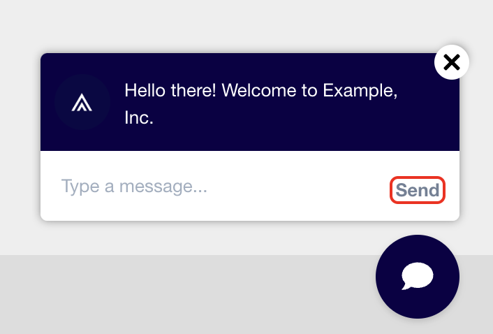
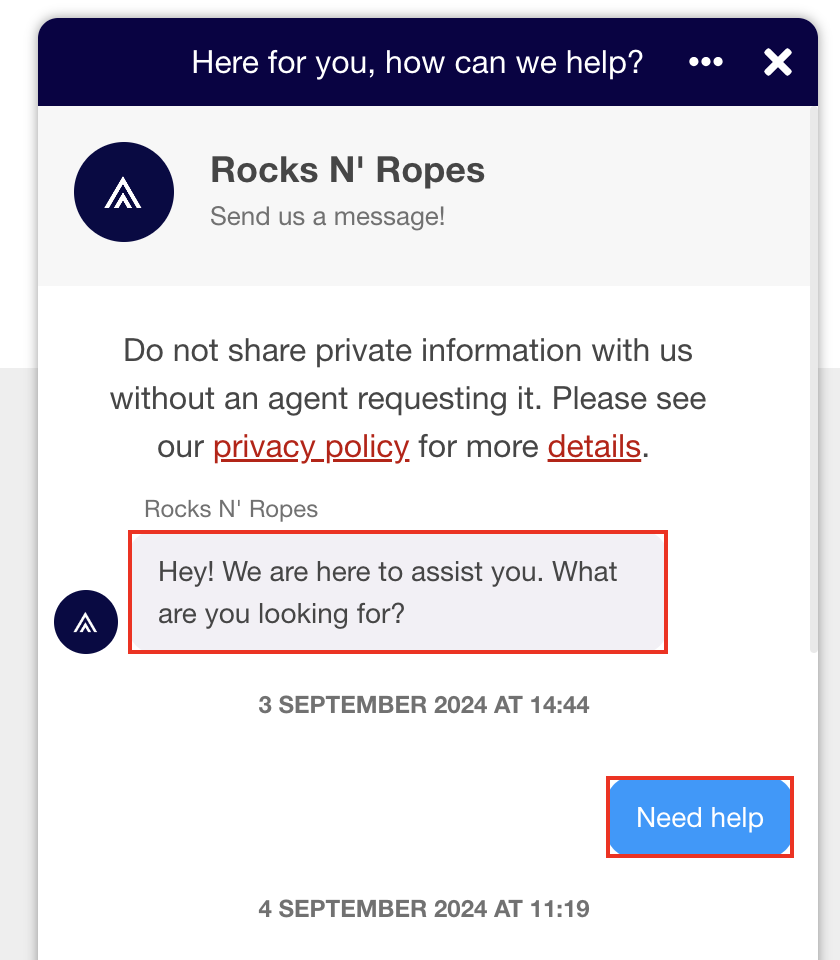
First Message
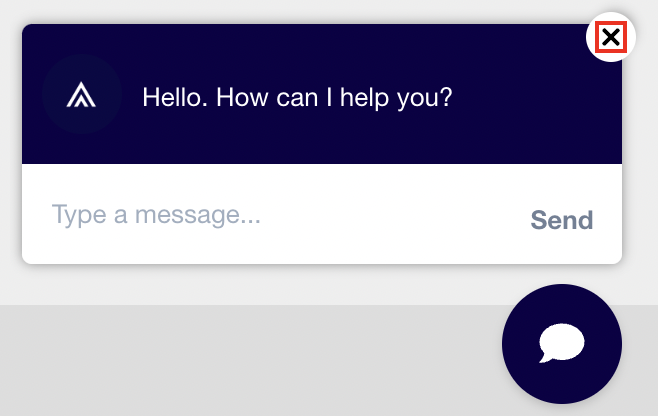
khFirstMessageCloseButton
The first pre-emptive message is closed using this button. This CSS class targets the image that makes up the X symbol in the button.
.khFirstMessageCloseButton {
    border: 1px solid red;
}
khCloseButtonWrapper
The wrapper surrounding the close button image.
.khCloseButtonWrapper {
    border: 2px solid red;
}
khFirstChatMessageHeader
The header section that wraps the entire upper section the first message is contained within.
.khFirstChatMessageHeader {
    border: 2px solid red;
}
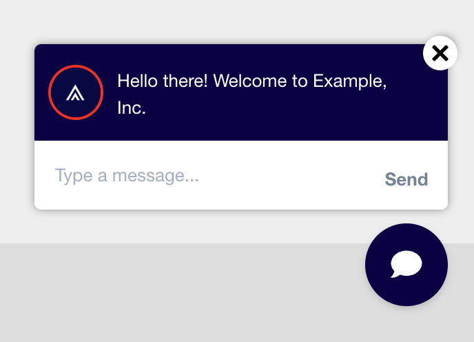
khFirstChatMessageHeaderImage
The logo image located in the header of the first message.
.khFirstChatMessageHeaderImage {
    border: 2px solid red;
}
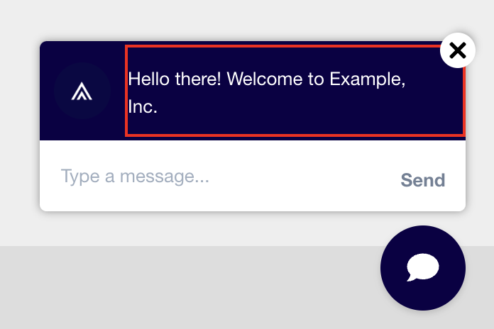
khFirstChatMessageHeaderText
The text of the first message. This is typically an introduction. For example: "Welcome to Example, Inc. How can we help?"
.khFirstChatMessageHeaderText {
    border: 2px solid red;
}
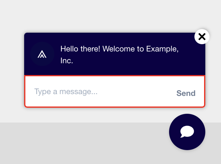
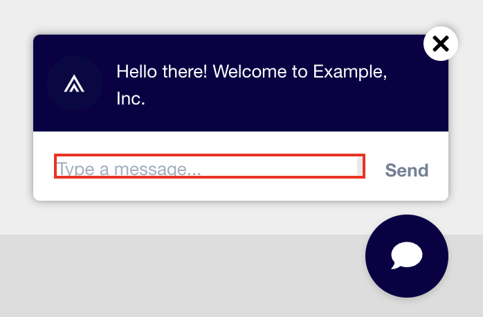
khFirstMessageRespondChatArea
The text input area of the first message. This is where the user puts their initial response to the first message.
.khFirstMessageRespondChatArea {
    border: 2px solid red;
}
khFirstMessageTextAreaWithButtons
When the first message includes button response options instead of a text input field, this class wraps the input section.
.khFirstMessageTextAreaWithButtons {
    border: 2px solid red;
}
khSendButton
The button users press to send their response to the first message. This is located within the First Message Respond Chat Area.
.khSendButton {
    border: 2px solid red;
}
khFirstChatInputArea
This includes just the text input field within the First Message Respond Chat Area where the user inputs their text prior to sending their first response.
#khFirstChatInputArea {
    border: 2px solid red;
}
Chat Window
Header
khChatWindowHeader
The header section of the chat window.
#header.khChatWindowHeader {
    border: 2px solid red;
}
khChatWindowHeaderText
The text within the chat window's header.
.khChatWindowHeaderText {
    border: 2px solid red;
}
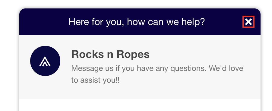
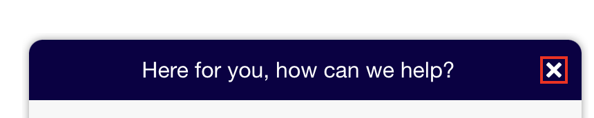
khChatWindowHeaderCloseButton
The close icon within the chat window's header.
.khChatWindowHeaderCloseButton {
    border: 2px solid red;
}
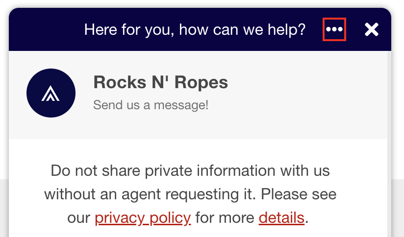
# khoros_ellipsis_div
The additional options ellipsis icon within the chat window's header.
#khoros_ellipsis_div {
    border: 2px solid red;
}
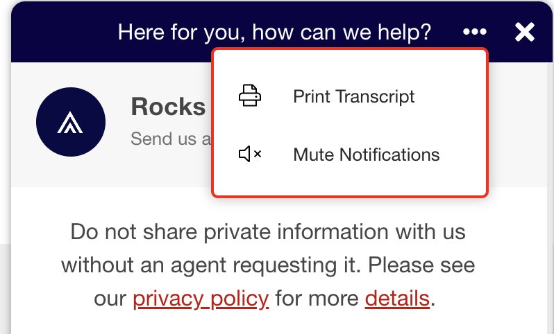
# khoros_ellipsis_popup_menu
The modal that pops up when the user selects the additional options ellipsis icon.
#khoros_ellipsis_popup_menu {
    border: 2px solid red;
}
# khoros_ellipsis_print_option_id
The section of the additional options modal that enables the user to print a transcript of the chat.
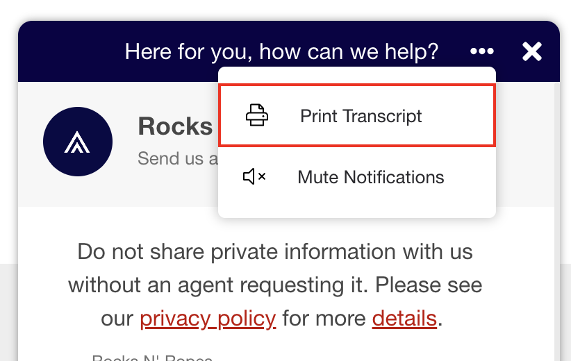
#khoros_ellipsis_print_option_id {
    border: 2px solid red;
}
# khoros_ellipsis_mute_option_id
The section of the additional options modal that enables the user to mute notifications in the chat.
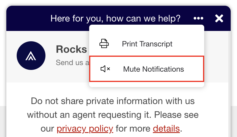
#khoros_ellipsis_mute_option_id {
    border: 2px solid red;
}
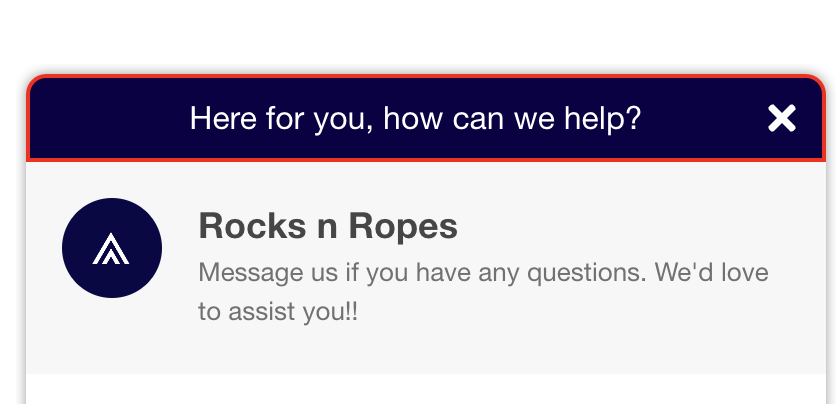
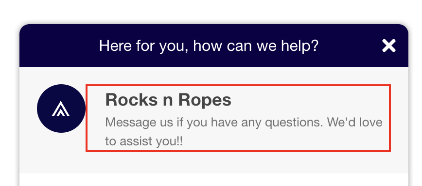
Business Profile
Classes listed in this section are specific to the Business Profile section of the chat widget. This section includes the business' logo/icon, name, and introductory text.
.khBusinessProfile
The entire Business Profile section of the chat interface.
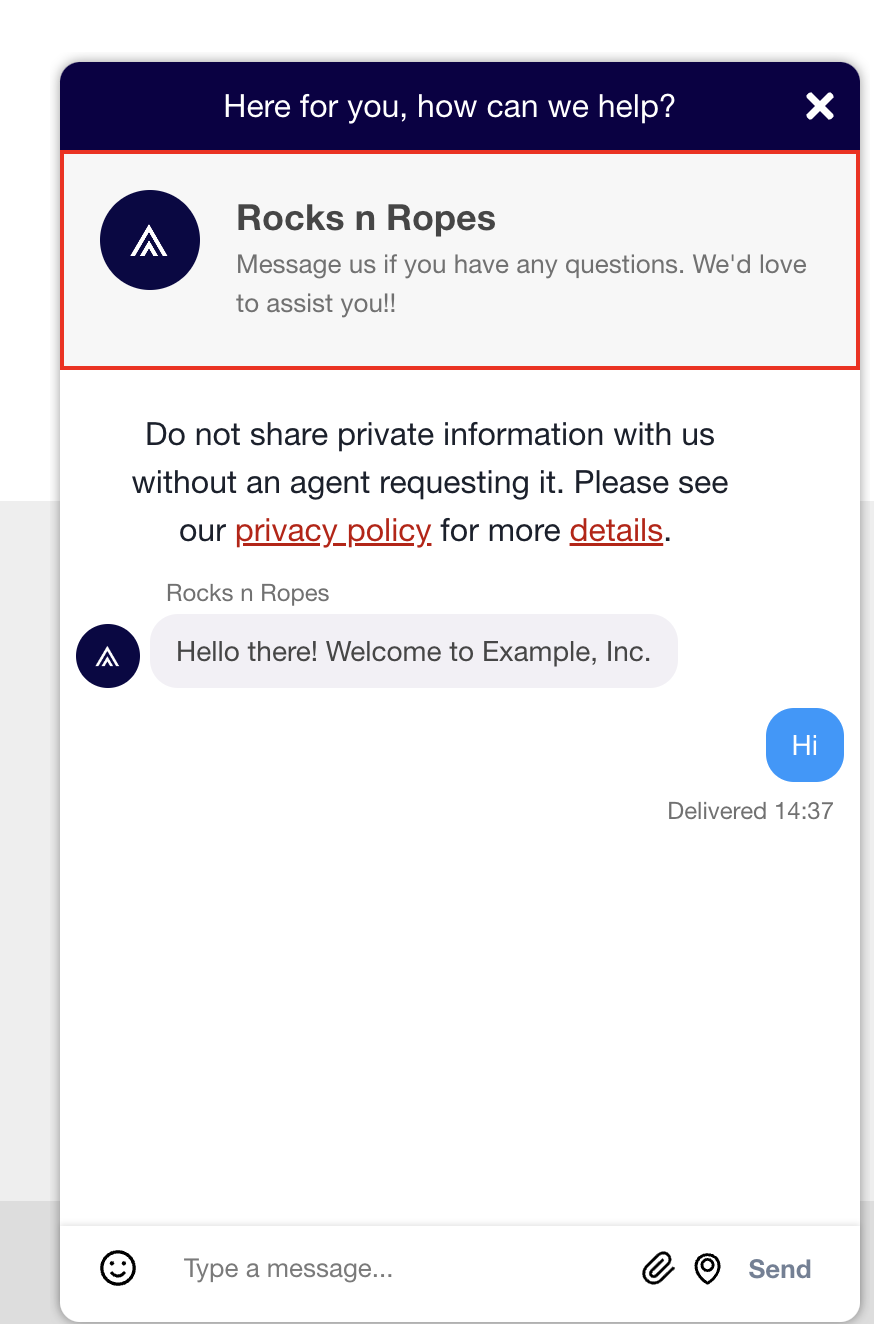
.khBusinessProfile {
    border: 2px solid red;
}
.khBusinessProfileIcon
The profile icon within the Business Profile section of the chat.
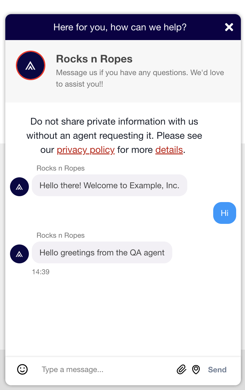
.khBusinessProfileIcon {
    border: 2px solid red;
}
.khBusinessProfileInfoContainer
The wrapper that contains the Business Profile Name and Business Profile Intro Text.
.khBusinessProfileInfoContainer {
    border: 2px solid red;
}
.khBusinessProfileName
The name of the business within the Business Profile section of the chat.
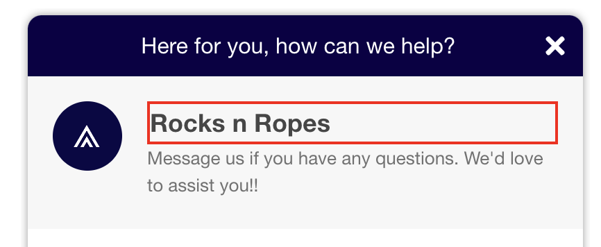
.khBusinessProfileName {
    border: 2px solid red;
}
.khBusinessProfileIntroText
The introductory text for the business within the Business Profile section of the chat.
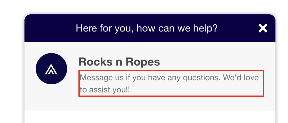
.khBusinessProfileIntroText {
    border: 2px solid red;
}
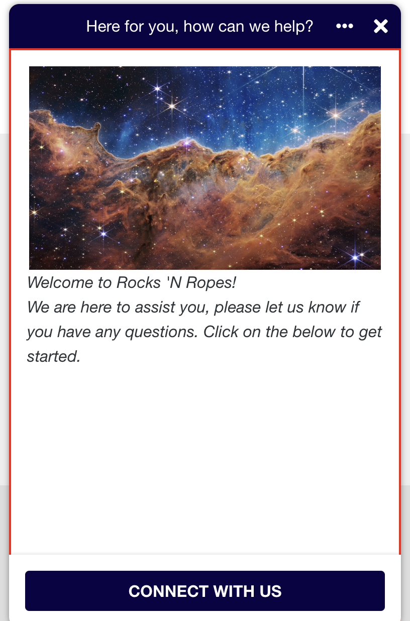
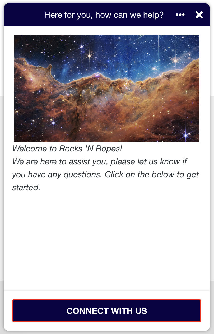
Welcome Screen
.khWelcomeScreenContainer
The wrapper containing the Welcome Screen.
.khWelcomeScreenContainer {
    border: 2px solid red;
}
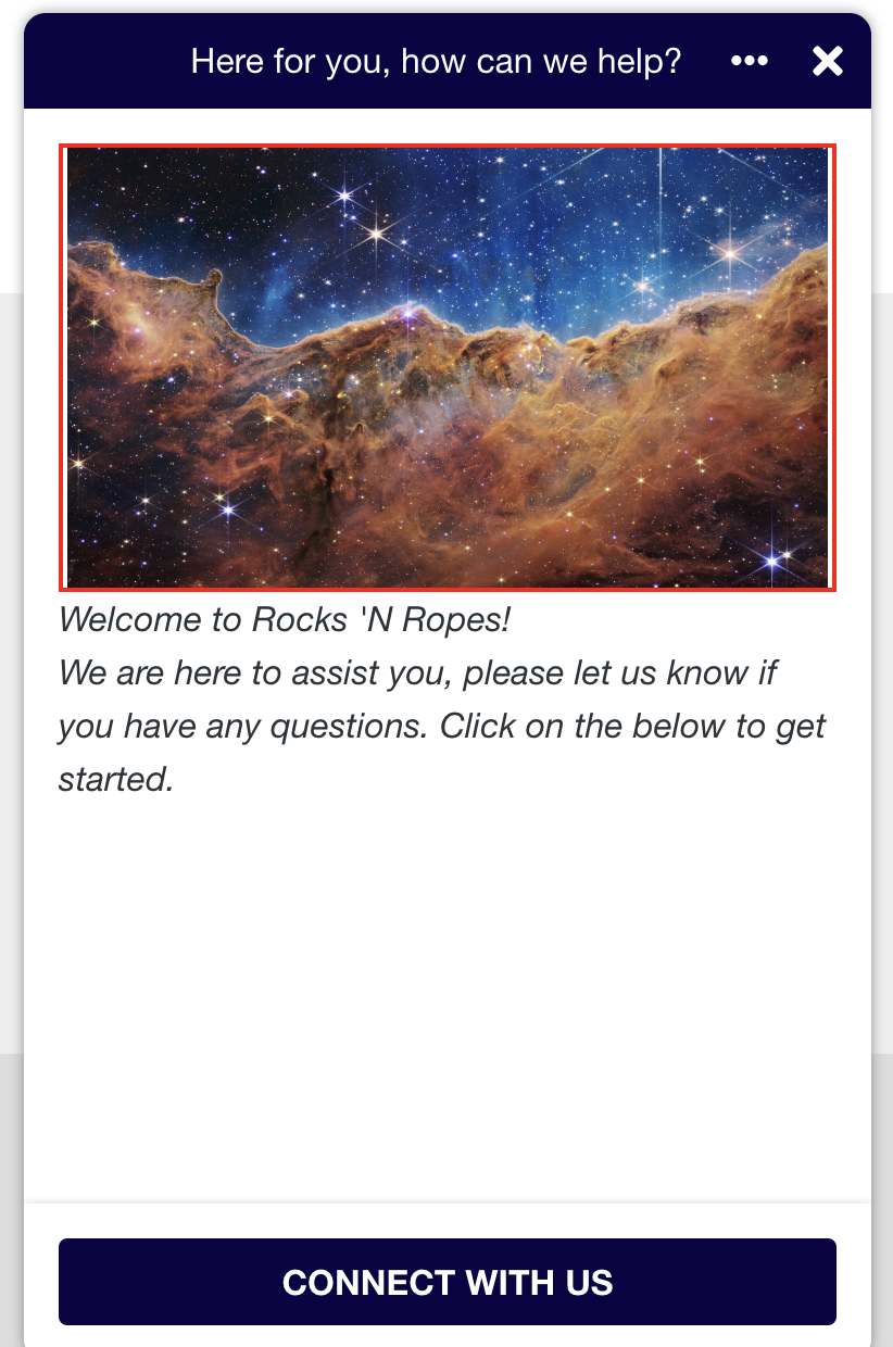
.khWelcomeScreenContent
The content area of the Welcome Screen, containing the image and introduction.
.khWelcomeScreenContent {
    border: 2px solid red;
}
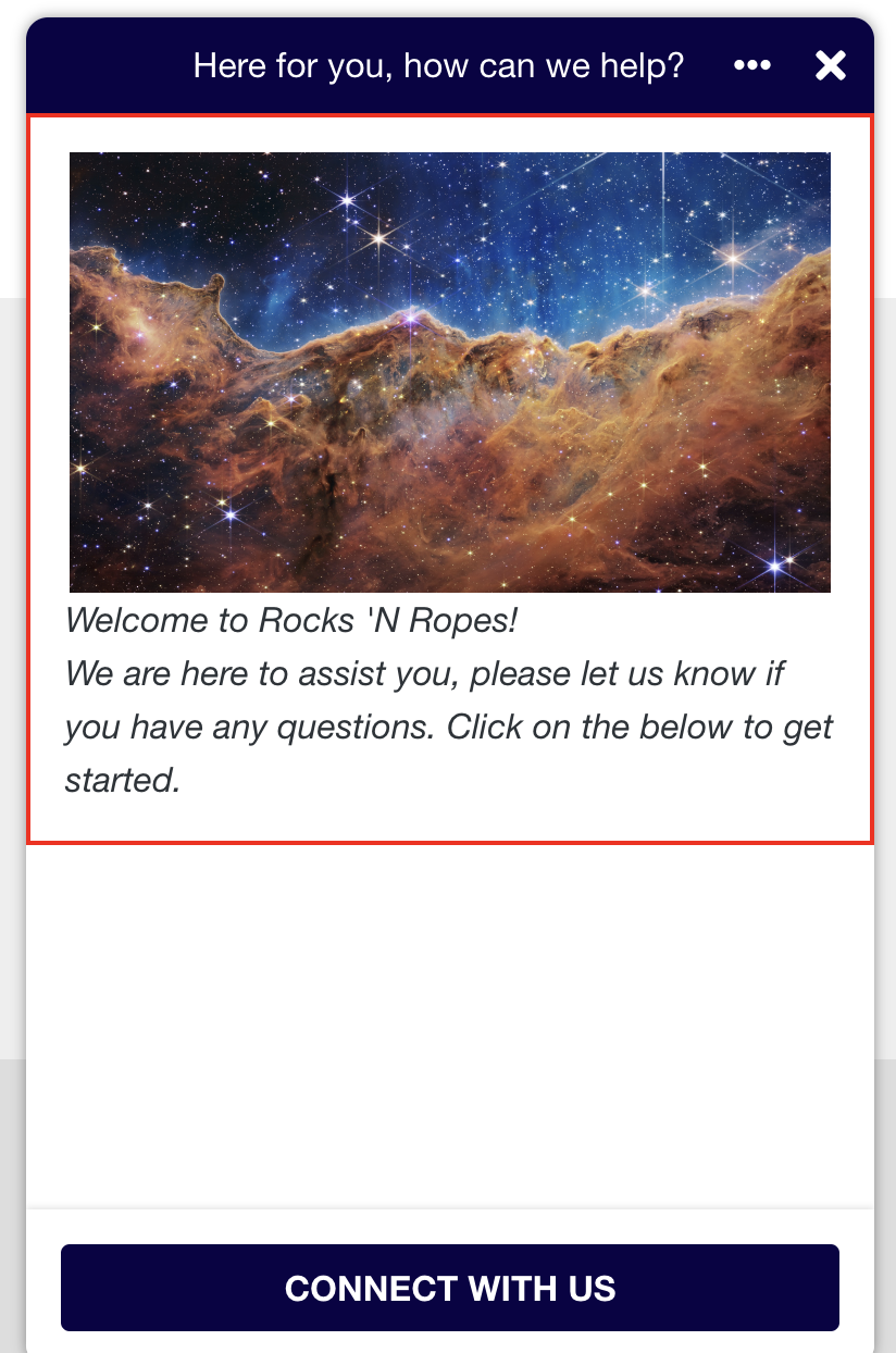
.khWelcomeScreenImageContainer
The image within the Welcome Screen.
.khWelcomeScreenImageContainer {
    border: 2px solid red;
}
.khWelcomeScreenIntroduction
The introductory text within the Welcome Screen.
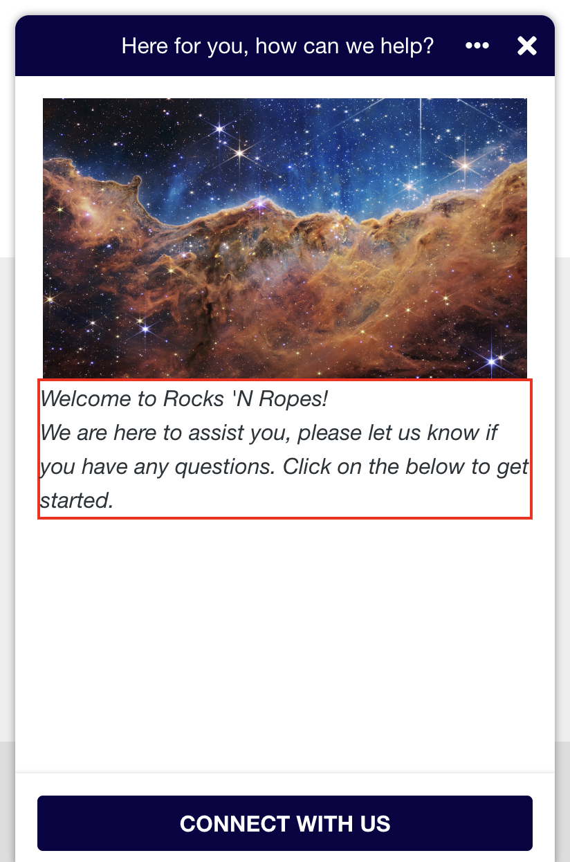
.khWelcomeScreenIntroduction {
    border: 2px solid red;
}
.khWelcomeScreenButtonContainer
The wrapper containing the button that sits at the bottom of the Welcome Screen.
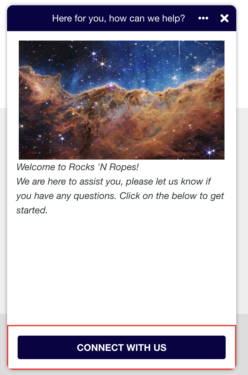
.khWelcomeScreenButtonContainer {
    border: 2px solid red;
}
# khorosWelcomeScreenButton
The button at the bottom of the Welcome Screen.
#khorosWelcomeScreenButton {
    border: 2px solid red;
}
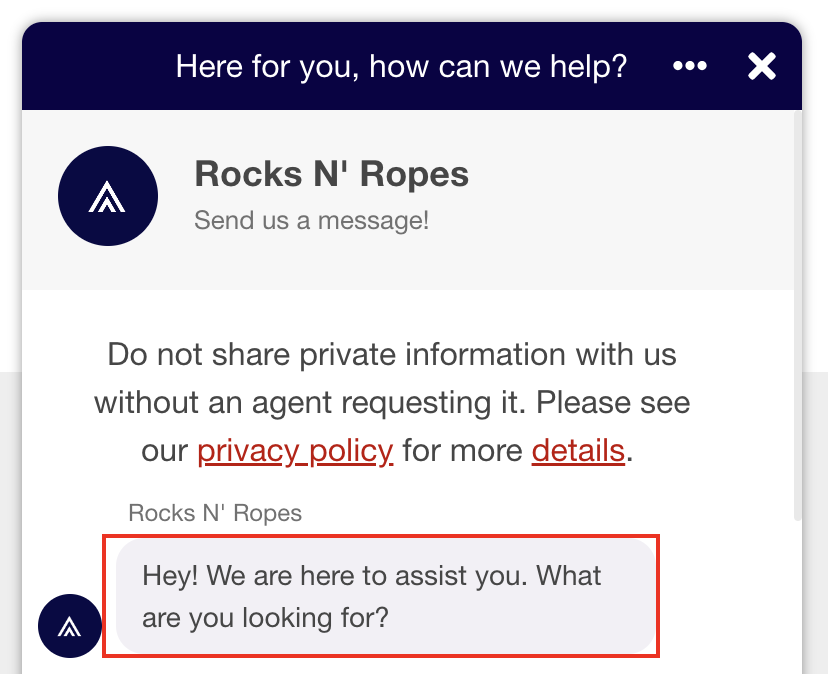
System Message
khSystemMessage
The system message defined in the theme appears.
.khSystemMessage {
     background-color: #0000FF;
}
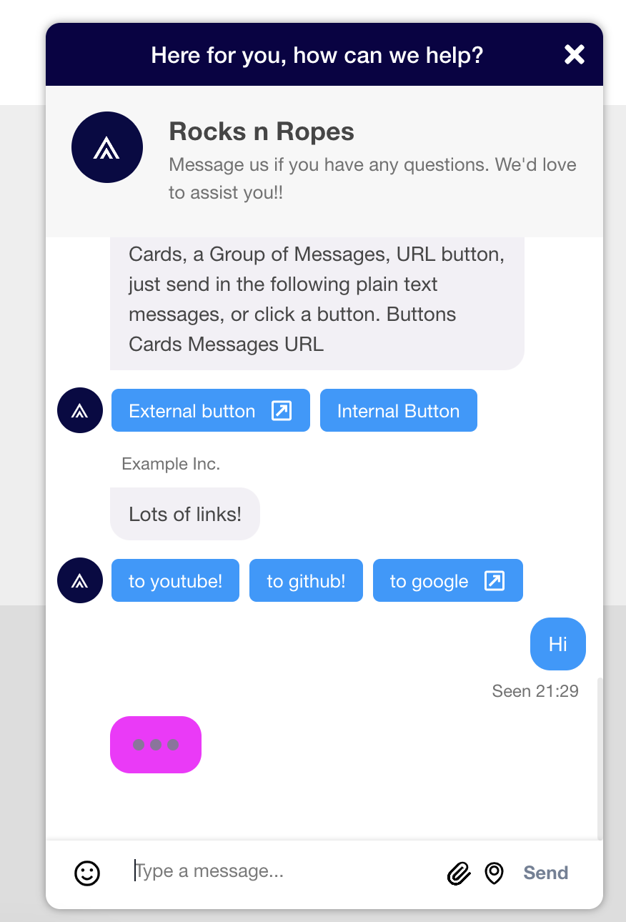
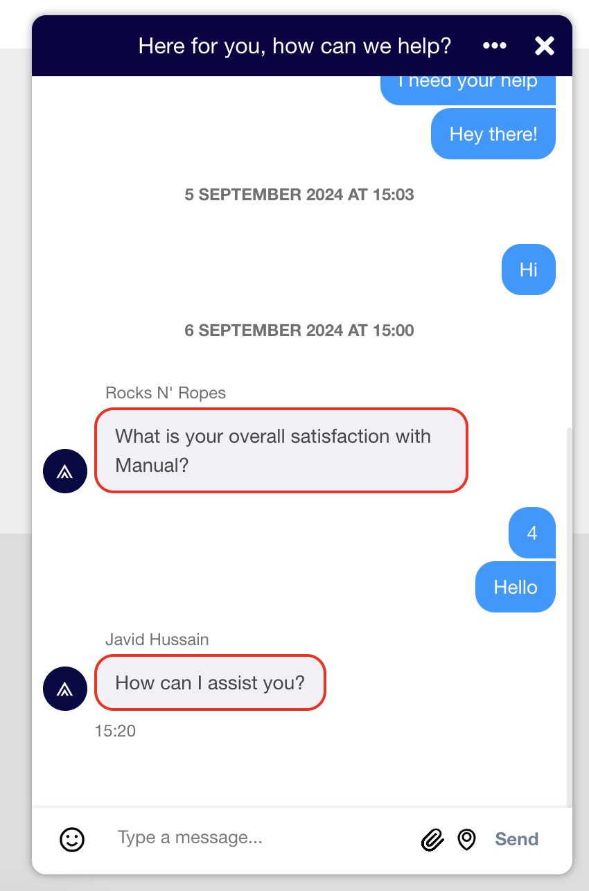
Typing Indicator
khTypingIndicator
When an agent writes to the conversation, the typing indicator appears as three-animated dots.
.khTypingIndicator {
     background-color: #FF00FF;
}
Scroll Area
khScrollArea
The scroll area of your chat widget screen where the conversation messages are displayed.
.khScrollArea {
  background-color: #FFFF00;
}
Inline Timestamp
khInlineTimeStamp
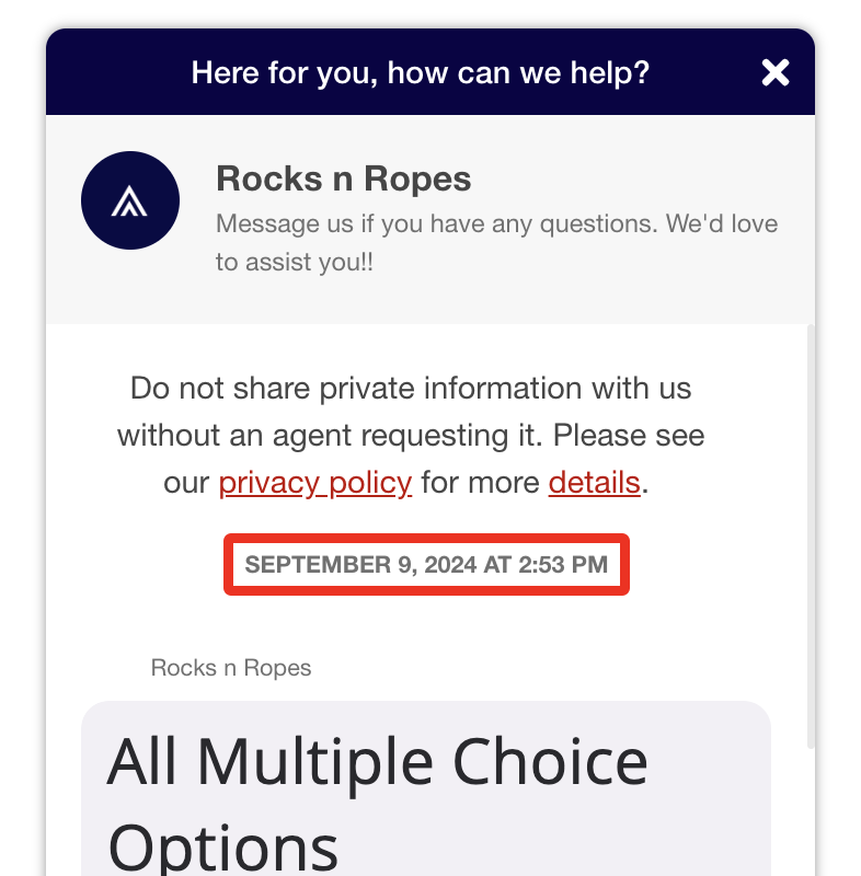
The timestamp displayed at the beginning of a conversation. It's also displayed if the day has changed or if more than 10 hours have passed since the last message.
.khInlineTimeStamp {
  background-color: #00FF00;
}
Loading Animation
khLoadingAnimation
The Animation when the chat widget loads.
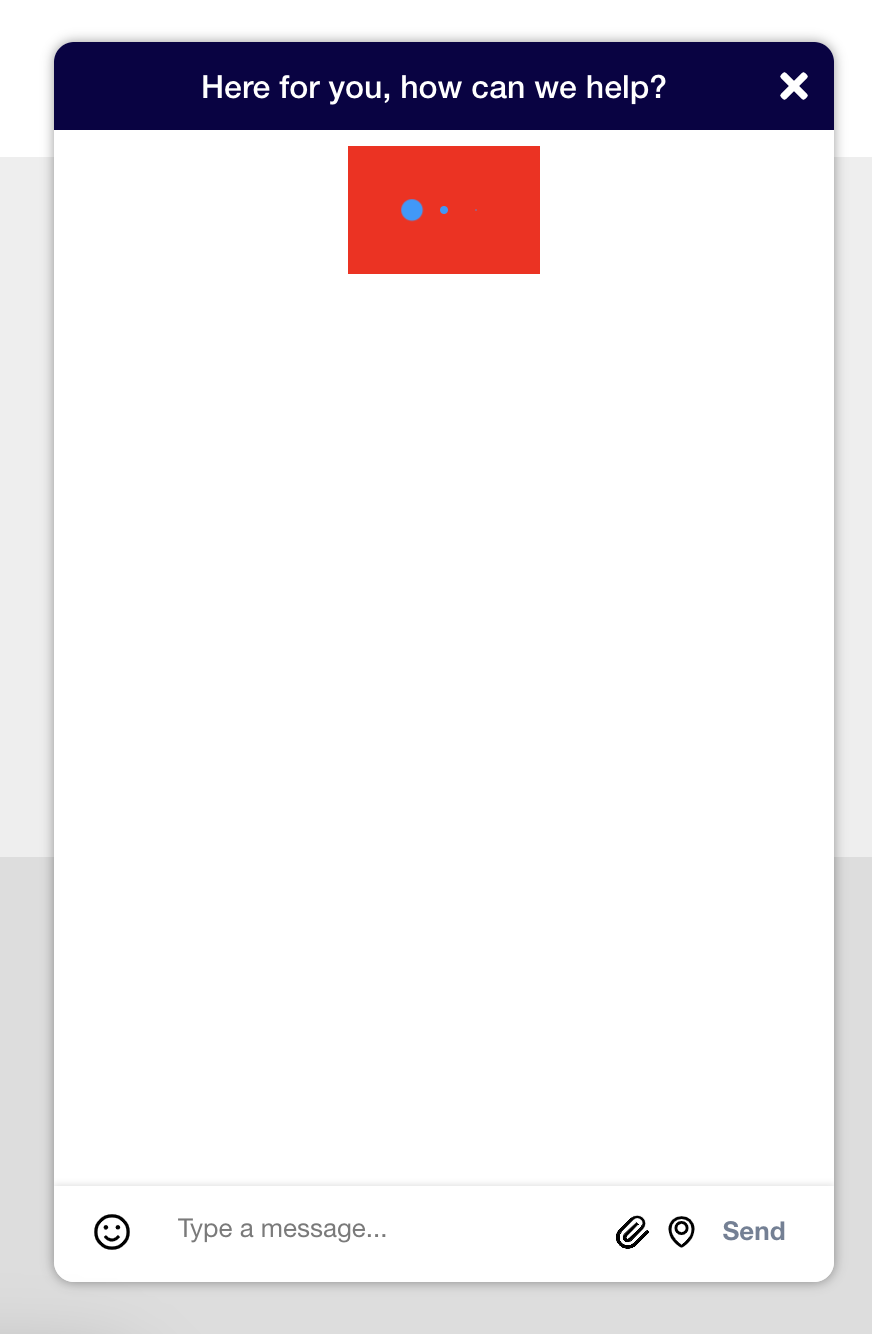
.khLoadingAnimation {
  background-color: #FF0000;
}
Markdown Support
The Modern Chat widget supports Common Mark Markdown Syntax.
khMarkdownContainer
The .khMarkdownContainer class is added to all areas of the widget that support Markdown content. This will provide structured HTML output of Markdown rather than standard text nodes.
This class appears as an additional class on elements with the following classes:
.khFirstChatMessageHeaderText.khMessageBubbleText
khMarkdownTag-tagname
Using this class enables you to customize the appearance of various HTML tags when triggered through Markdown syntax.
Supported tags include:
ablockquotebrcodeemh1h2h3h4h5h6hrimgliolpprestrongul
For example, if a message contains the following Markdown:
## Hello H2
### Hello H3
You can customize how H2 and H3 tags are rendered using this class:
.khMarkdownTag-h2 {
   color: red;
}

.khMarkdownTag-h3 {
   color: blue;
}
khMarkdownList
This class customizes the appearance of ordered (ol) and unordered (ul) lists when written in Markdown.
Messages
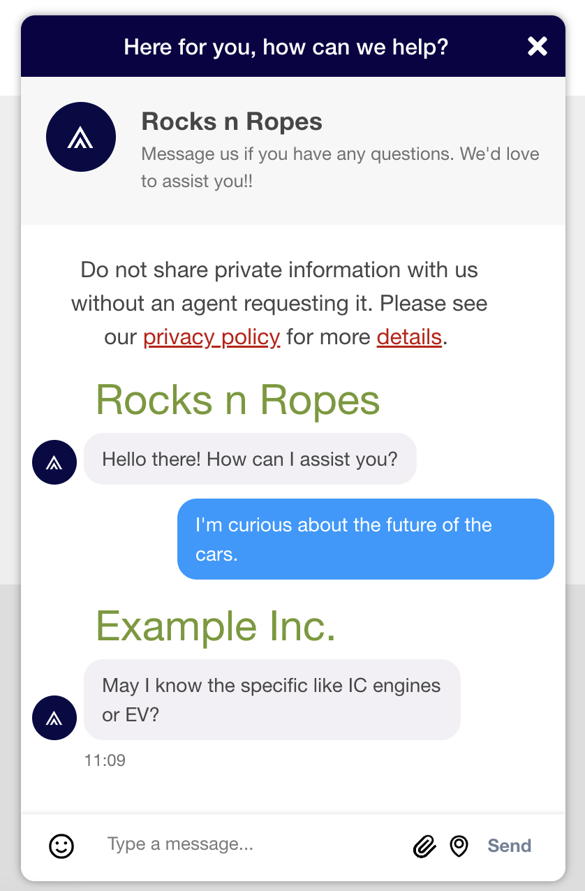
Message Bubbles
These classes target the message bubbles between the agent and user within the chat.
khMessageBubbleWrapper
The wrapper that contains the message bubble from the agent to the user.
.khMessageBubbleWrapper {
    border: 2px solid red;
}
khAgentMessageBubble
The agent message bubble containing the text sent by the agent to the user.
.khAgentMessageBubble {
   border: 2px solid red;
}
khMessageBubble
The user message bubble containing text sent by the user to the agent.
.khMessageBubble {
    border: 2px solid red;
}
khMessageBubbleText
The text within the agent message bubble.
.khMessageBubbleText {
   border: 2px solid red;
}
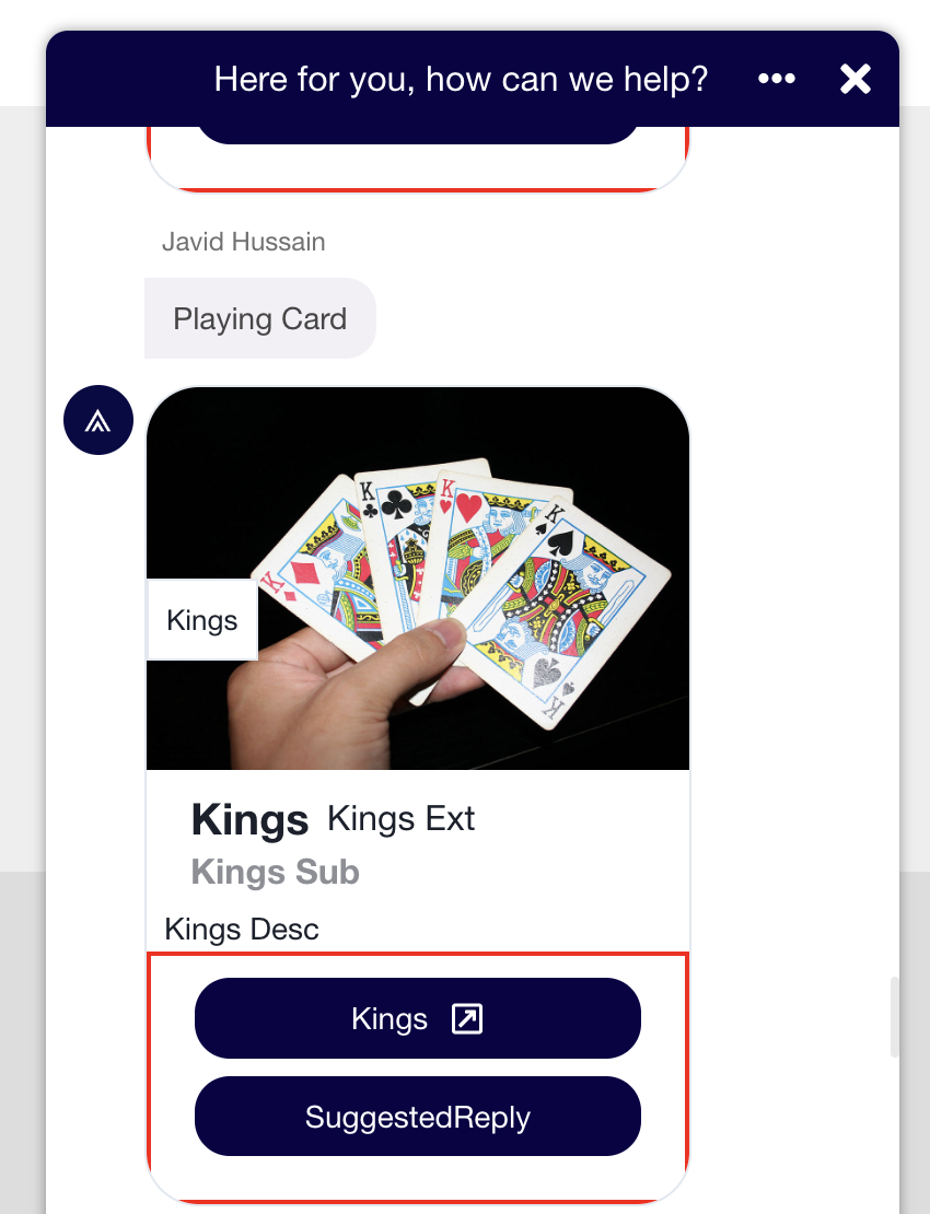
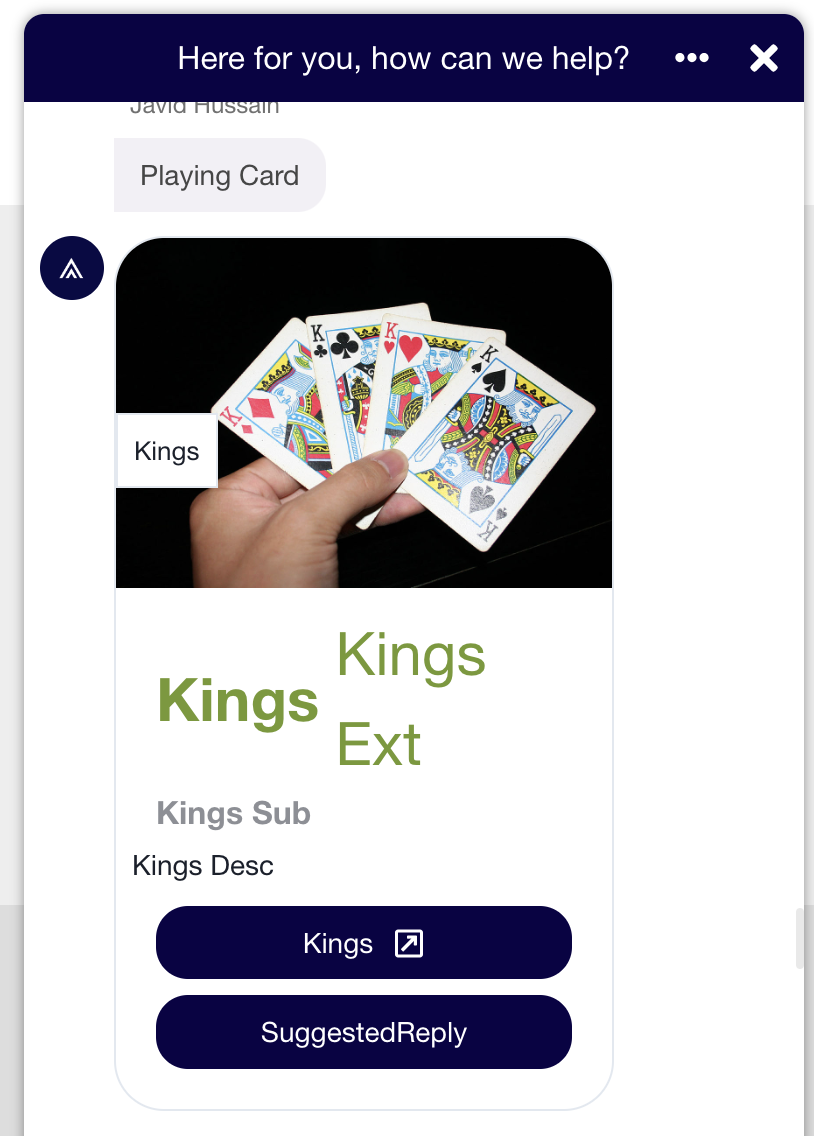
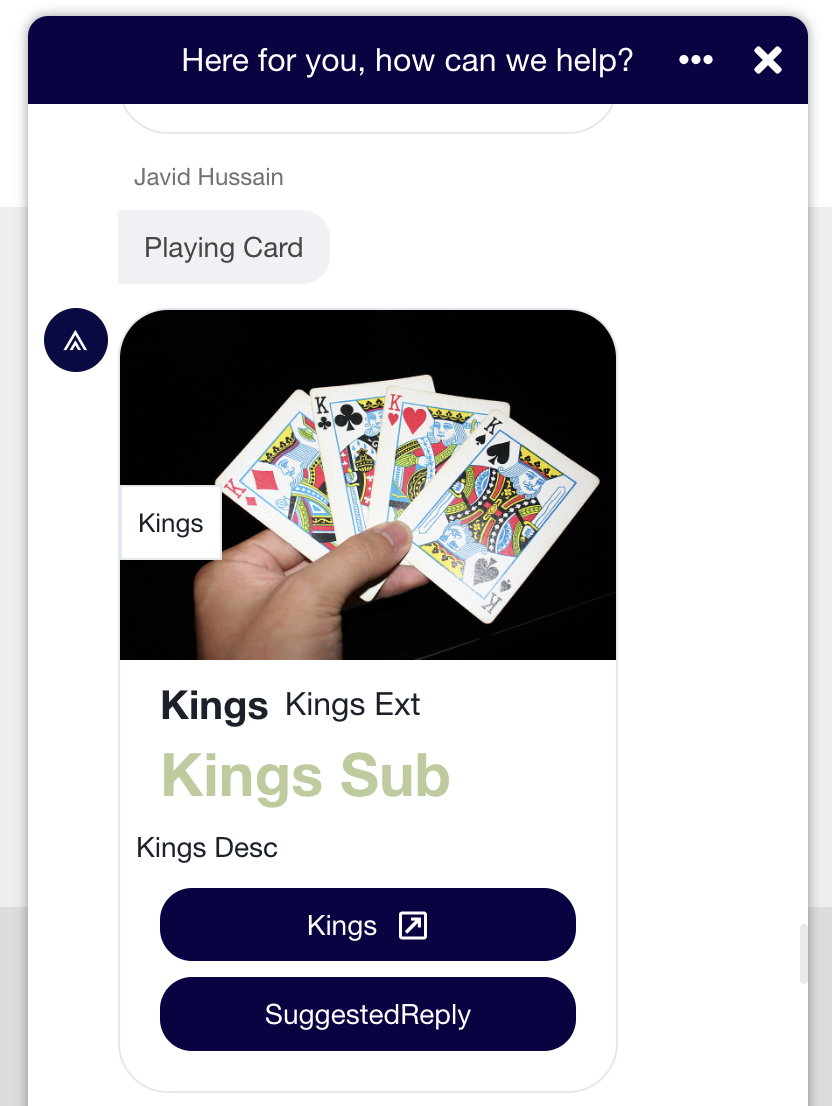
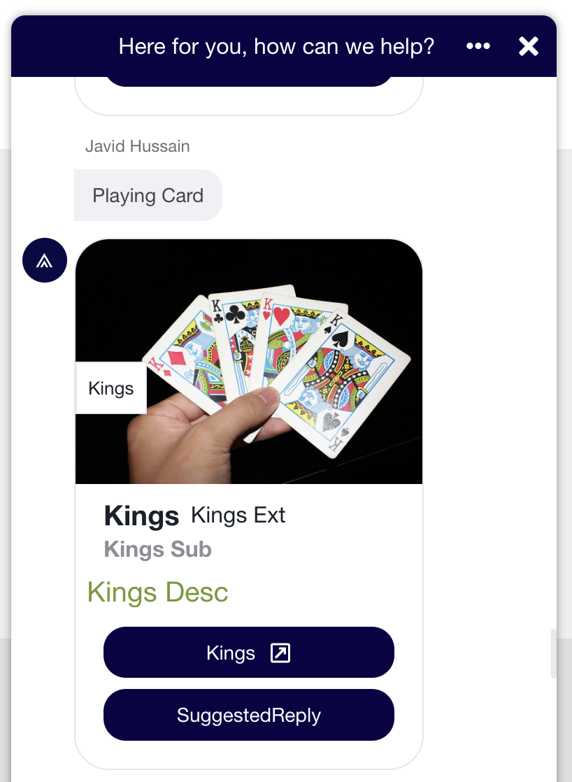
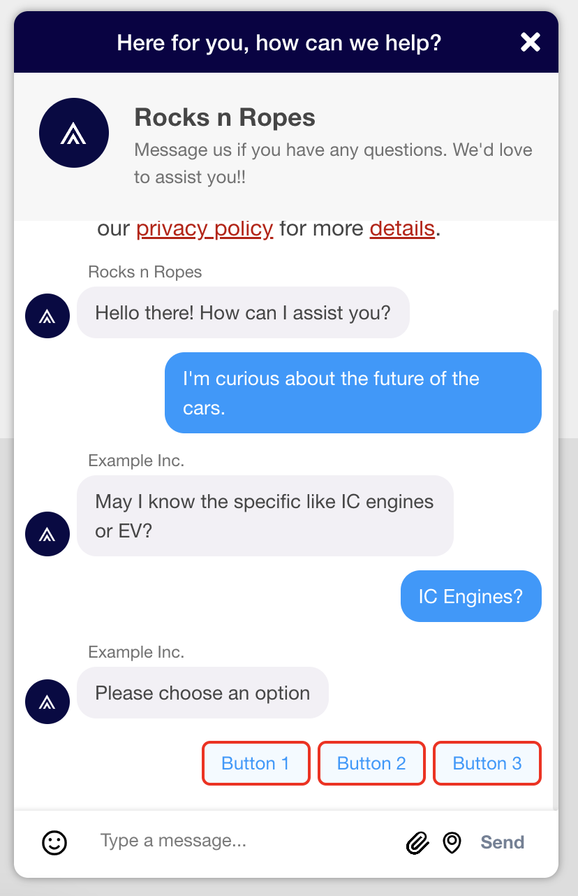
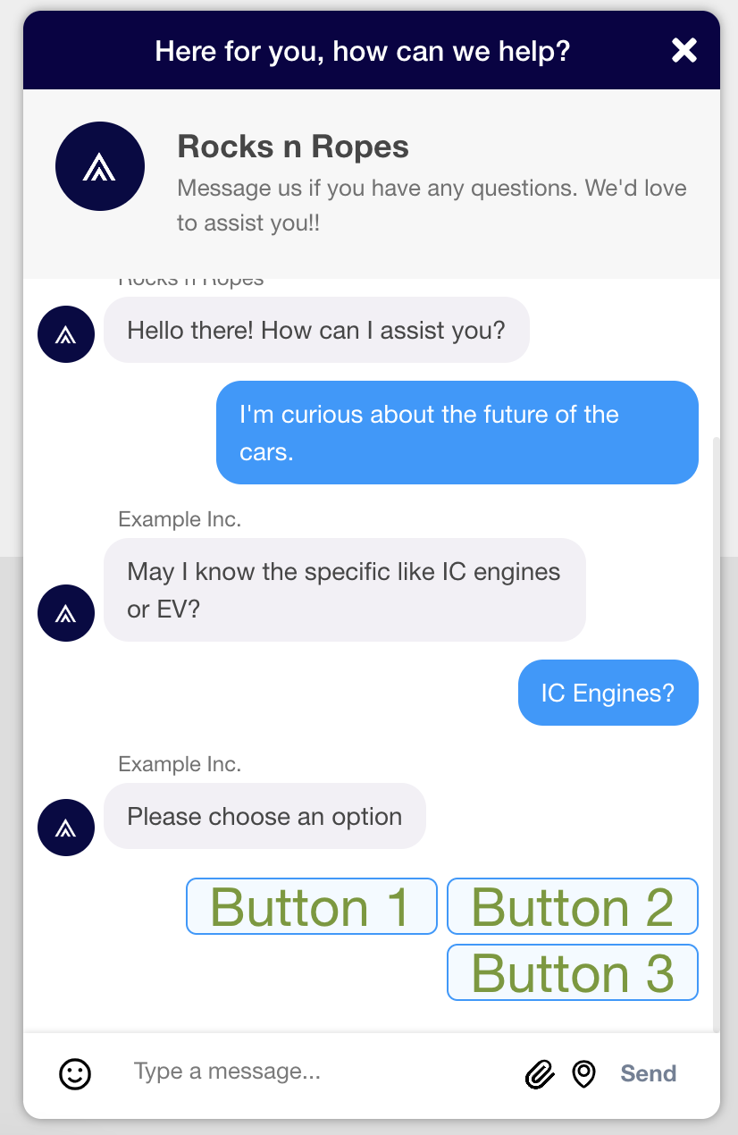
Message Cards
These classes work with Cards that are presented to the user during the chat.
khCardMessageBody
The container that holds the buttons and content for the card. This does not include the title of the card.
.khCardMessageBody {
    border: 2px solid red;
}
khCardMessageTitleWrapper
The container that holds the title of the card.
.khCardMessageTitleWrapper {
    border: 2px solid red;
}
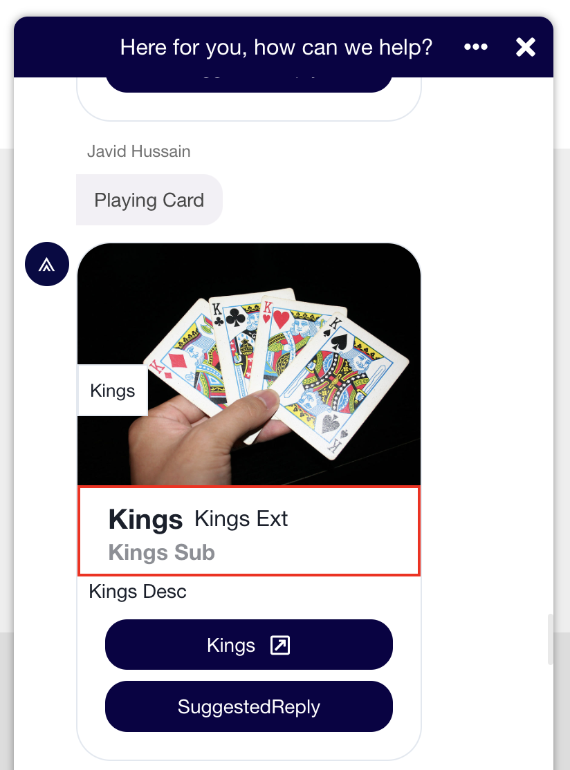
khCardMessageTitle
The title text for the card.
.khCardMessageTitle {
    color: #74992e;
    font-size: 30px;
}
khCardMessageSubtitle
The subtitle text for the card.
.khCardMessageSubtitle {
    color: #74992e;
    font-size: 30px;
}
khCardMessageDescription
The message description text for the card.
.khCardMessageDescription {
    color: #74992e;
    font-size: 20px;
}
khAgentName
The agent name as it appears with the card.

.khAgentName {
    color: #74992e;
    font-size: 30px;
}
khButton
The button(s) inside the card.

.khButton {
    border: 2px solid red;
}
Agent Avatar and Name
These classes focus on avatar styling within the conversation.
khAvatar
The agent avatar included with each agent message within the conversation.
.khAvatar {
   width: 80px;
   height: 20px;
}
khAgentName
The agent name appearing along with any messages sent by the agent during the conversation.
.khAgentName {
    color: #74992e;
    font-size: 30px;
}
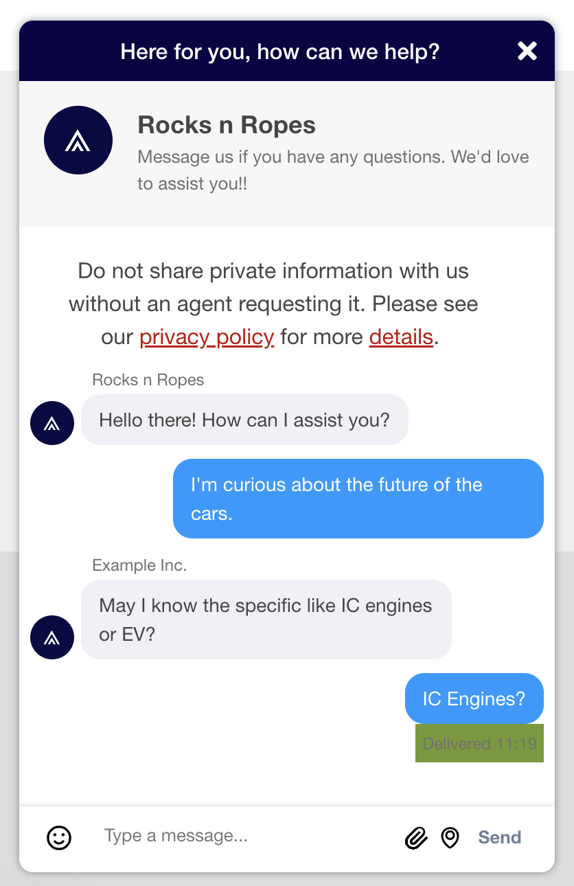
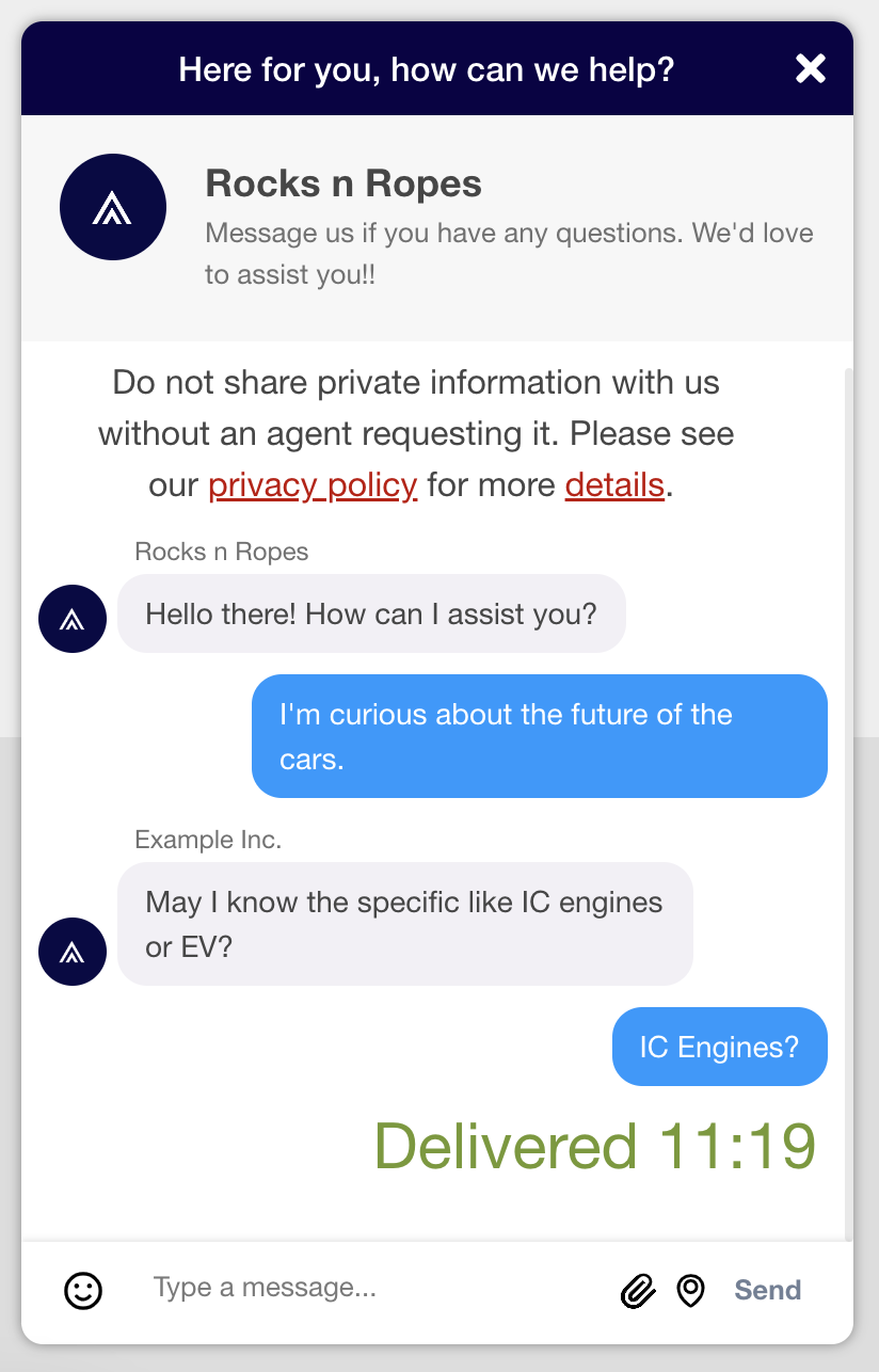
Timestamps
Timestamps appear with each message, indicating when the message was sent. Classes in this section enable you to customize the styling of the timestamp.
khTimeStampWrapper
The wrapper containing the timestamp with each message.
.khTimeStampWrapper {
    background-color: #74992e
}
khTimeStampBox
The box containing the timestamp with each message. This is contained within the Timestamp Wrapper.
.khTimeStampBox {
    background-color: #74992e
}
khTimeStampText
The text that makes up the timestamp.
.khTimeStampText {
    color: #74992e;
    font-size: 30px;
}
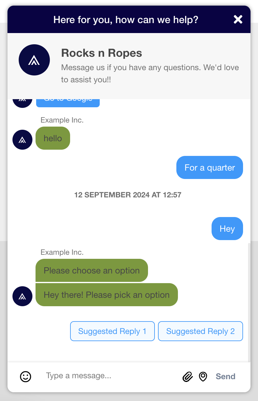
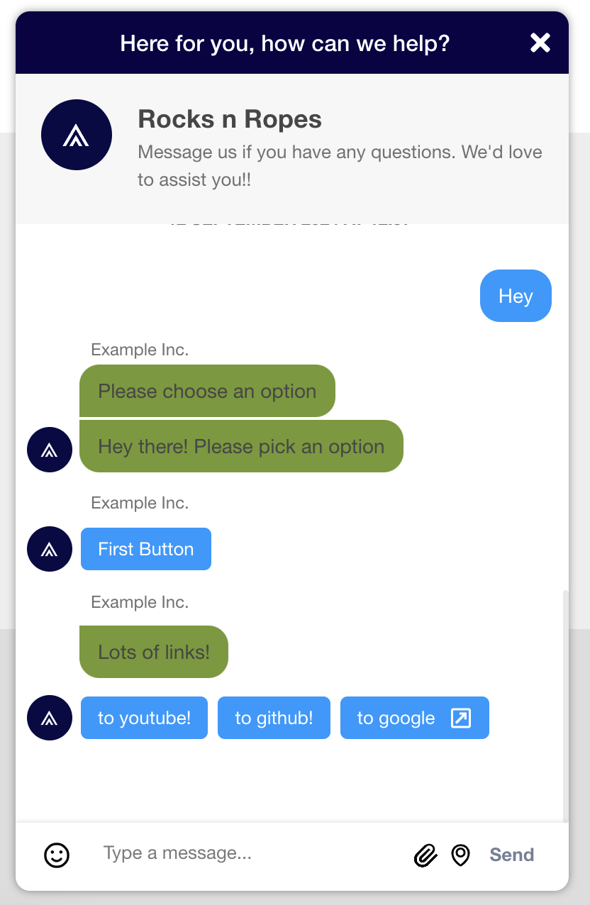
Suggested Replies
Suggested replies enable the agent to present the user with options to respond with. These classes focus on elements that are used to display suggested replies.
khAgentMessageBubble
The bubble containing text sent by the Agent along with the suggested reply options.
.khAgentMessageBubble {
    background-color: #74992e;
}
khSuggestedReplyButton
Buttons that make up the suggested replies the user can choose from.
.khSuggestedReplyButton {
    border: 2px solid red;
}
khSuggestedReplyButtonText
Text within the suggested reply buttons.
.khSuggestedReplyButtonText {
    color: #74992e;
    font-size: 30px;
}
Link Buttons
Link buttons make it easy to direct users where they need to go. These classes focus on elements that are used to display link buttons to the user.
khAgentMessageBubble
The bubble contains text sent by the Agent along with the link buttons.
.khAgentMessageBubble {
    background-color: #74992e;
}
khLinkButton
The buttons that direct users to various links.
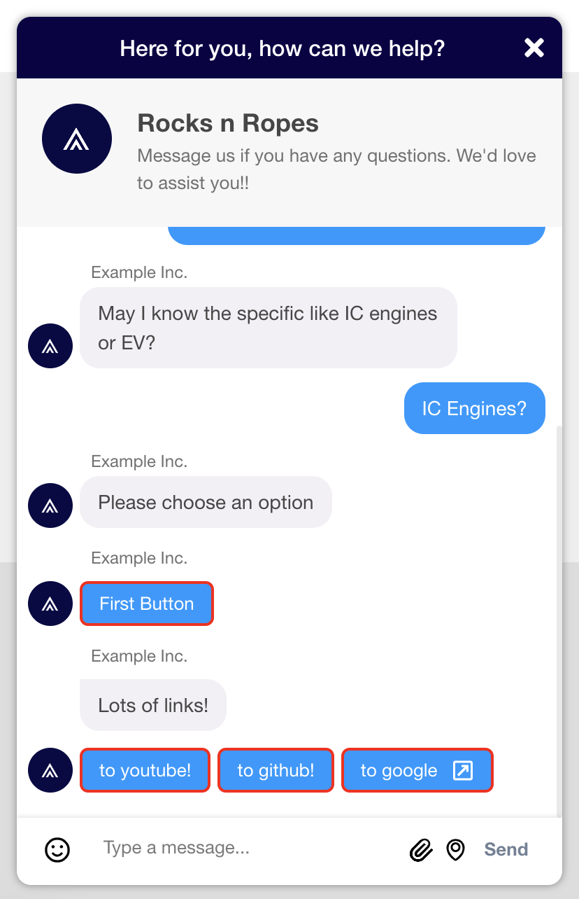
.khLinkButton {
    border: 2px solid red;
}
khLinkButtonText
The text contained within the link buttons.
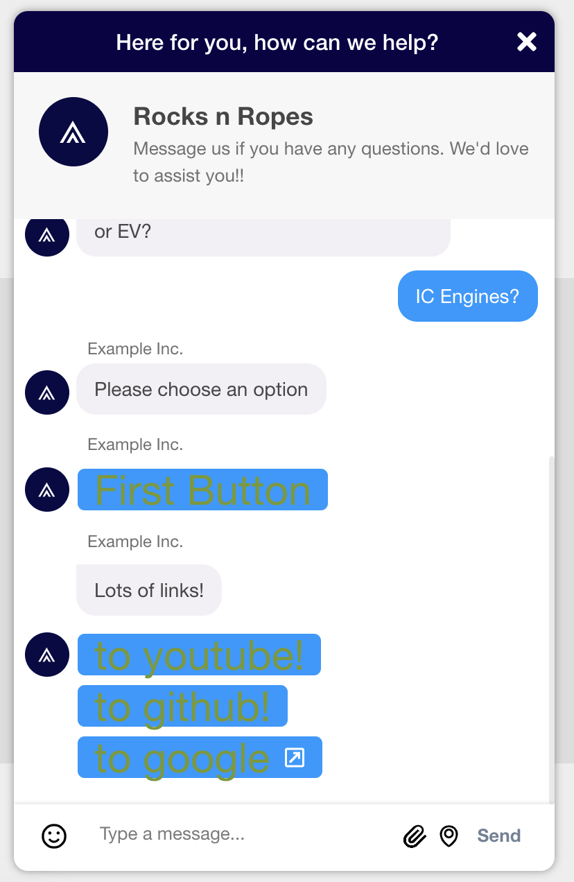
.khLinkButtonText {
    color: #74992e;
    font-size: 30px;
}
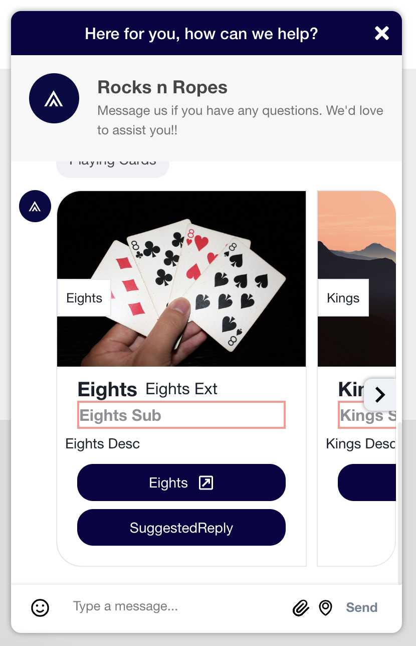
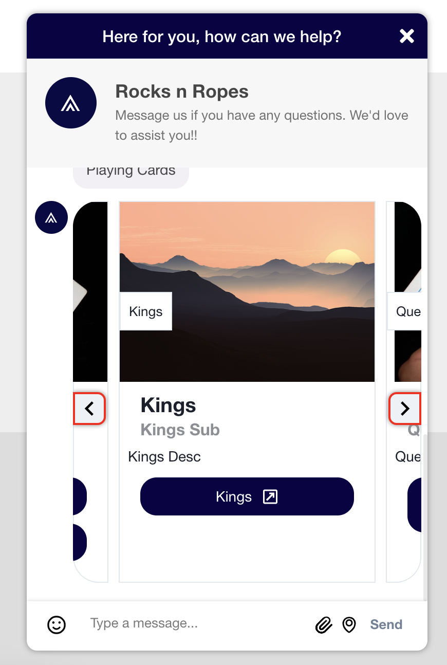
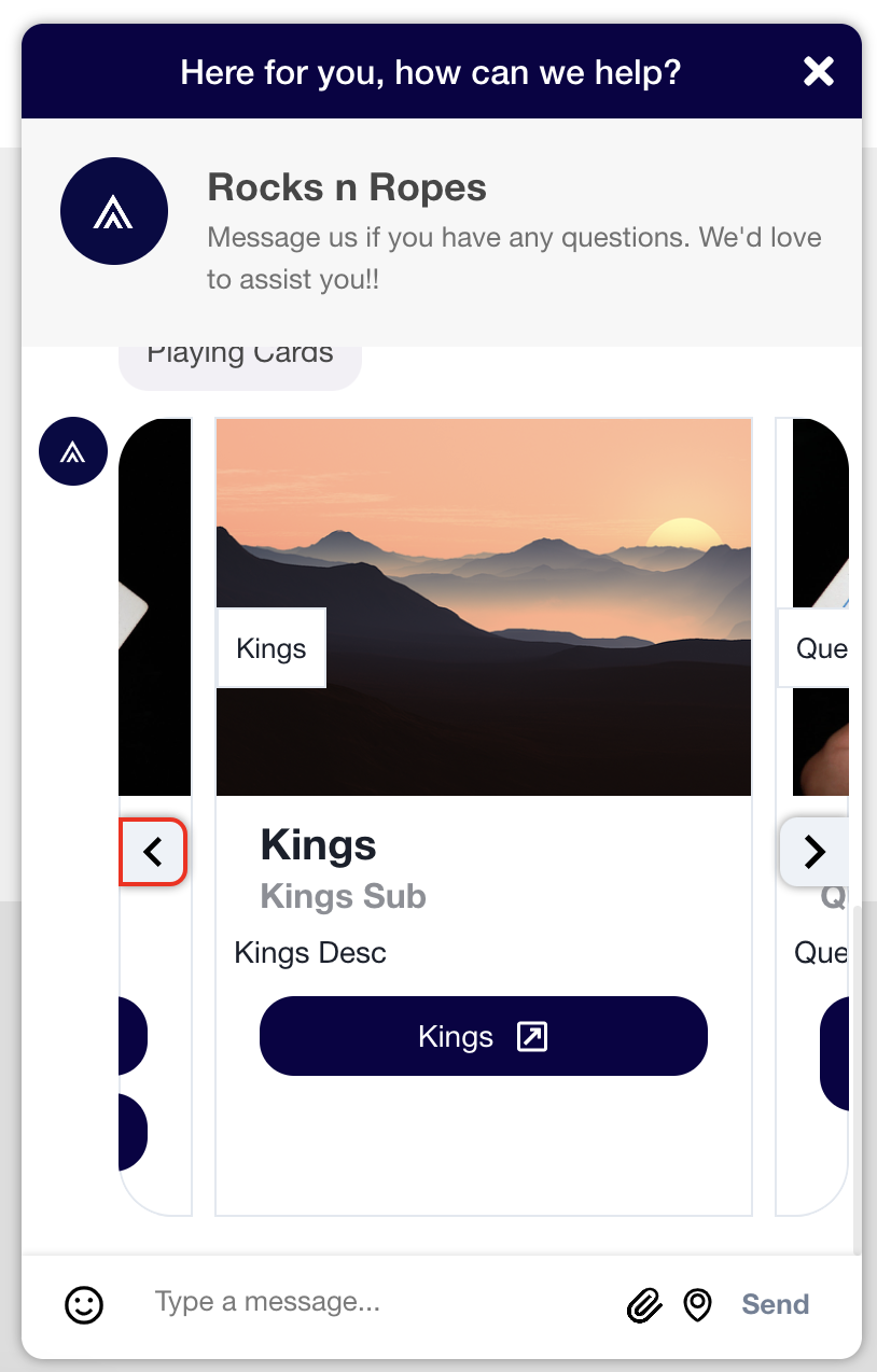
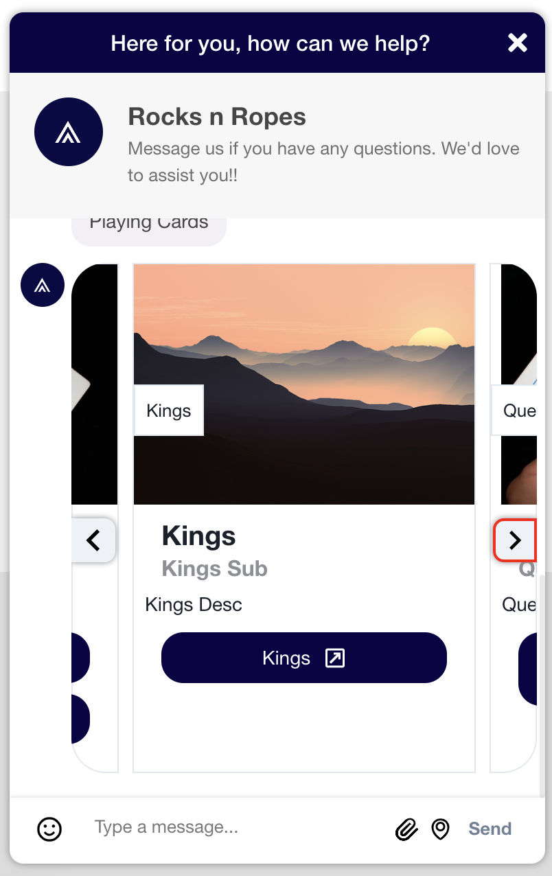
Carousel Cards (including arrows)
Carousel Cards are used to display large amounts of information to users within the scope of the conversation. These classes focus on the elements required to display Carousel Cards to users.
khCardHeaderBox
The Carousel Card's header box containing the header for each card.
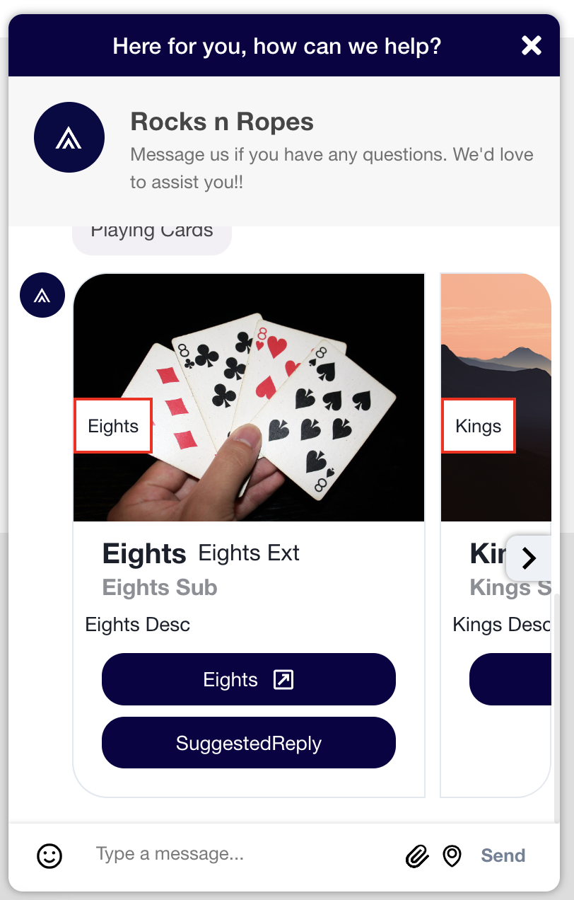
.khCardHeaderBox {
    border: 2px solid red;
}
khCardHeaderText
The text within the Carousel Card's header box.
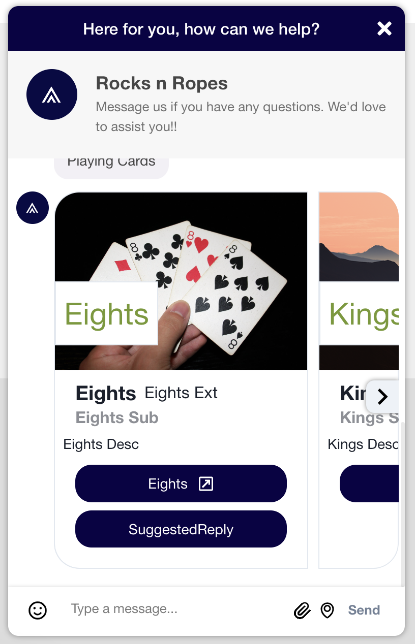
.khCardHeaderText {
    color: #74992e;
    font-size: 30px;
}
khCardWrapper
The wrapper containing the Carousel Card.
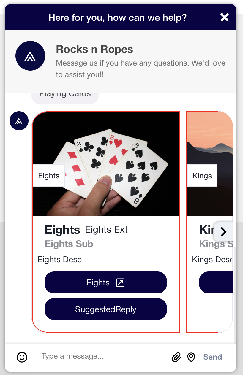
.khCardWrapper {
    border: 2px solid red;
}
khCardMessageBody
The message body of the Carousel Card. This does not include the header, image, title, subtitle, or description.
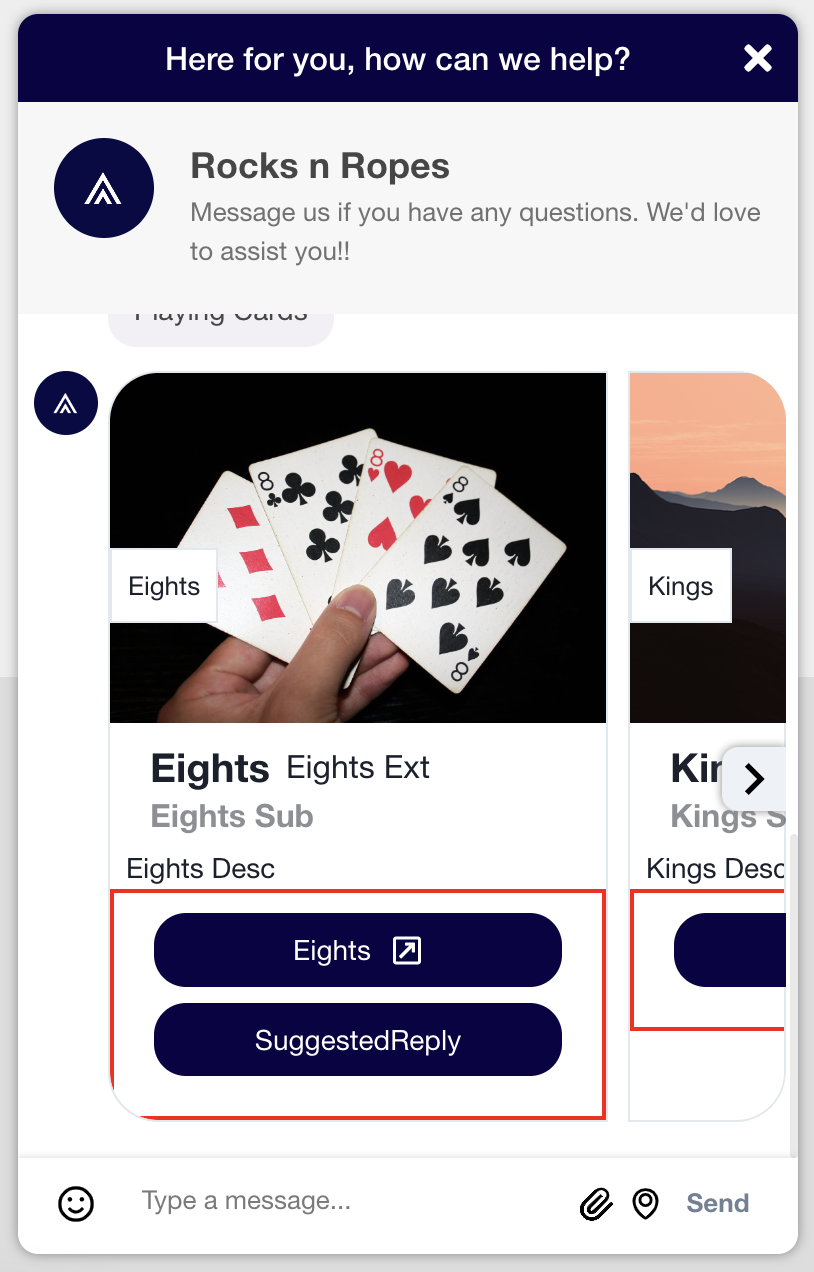
.khCardMessageBody {
    border: 2px solid red;
}
khCardMessageTitleWrapper
The wrapper containing the title and subtitle of the Carousel Card.
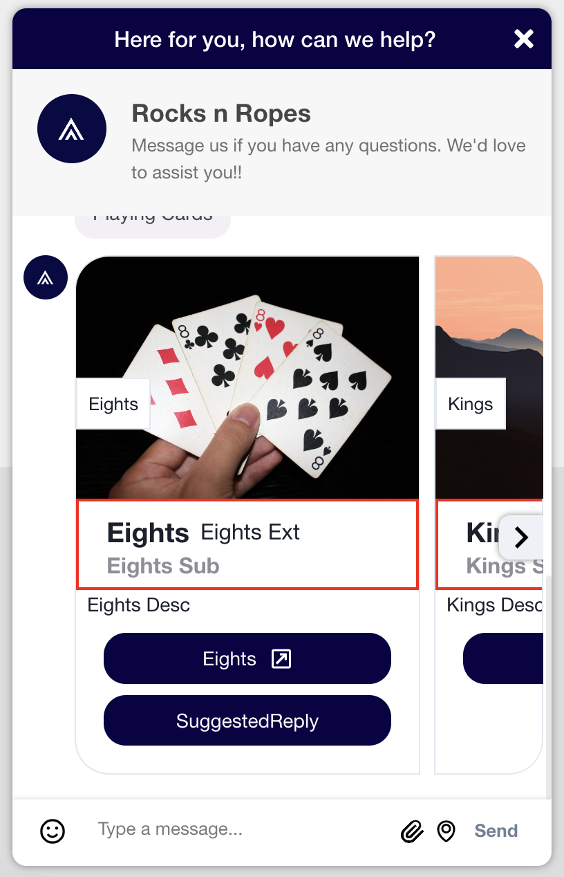
.khCardMessageTitleWrapper {
    border: 2px solid red;
}
khCardMessageTitle
The title text of the Carousel Card.
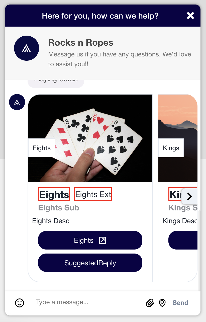
.khCardMessageTitle {
    border: 2px solid red;
}
khCardMessageSubtitle
The subtitle text of the Carousel Card.
.khCardMessageSubtitle {
    border: 2px solid red;
}
khCardMessageDescription
The description of the Carousel Card.
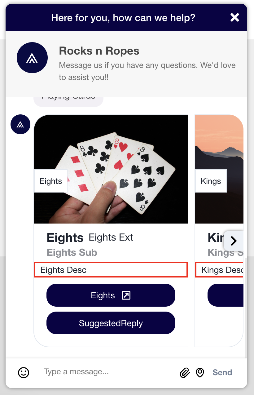
.khCardMessageDescription {
    border: 2px solid red;
}
khAgentName
The agent name as it appears with the Carousel Card.

.khAgentName {
    color: #74992e;
    font-size: 30px;
}
khButton
The button(s) included in the Carousel Card.
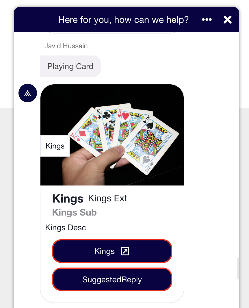
.khButton {
    border: 2px solid red;
}
khAgentMessageBubble
The message bubble for any additional message(s) that appear with the Carousel Card.
.khAgentMessageBubble {
    background-color: #74992e;
}
khCarouselArrow
The navigation arrows (left and right) that enables users to navigate between Carousel Cards.
.khCarouselArrow {
    border: 2px solid red;
}
khCarouselLeftArrow
Just the left navigation arrow.
.khCarouselLeftArrow {
    border: 2px solid red;
}
khCarouselRightArrow
Just the right navigation arrow.
.khCarouselRightArrow {
    border: 2px solid red;
}
Global Font
Changing the global font is done at the html level of the CSS.
Here is an example:
@import url('https://fonts.googleapis.com/css2?family=Roboto:wght@400;700&display=swap');

#web-messenger-container,
.khChatWindowHeaderText,
#web-messenger-container * {
font-family: Roboto;
}
Caution
An
importneeds to be performed for any specified font; otherwise the browser will use to its default font.
Secure Forms
Widget Elements
Background
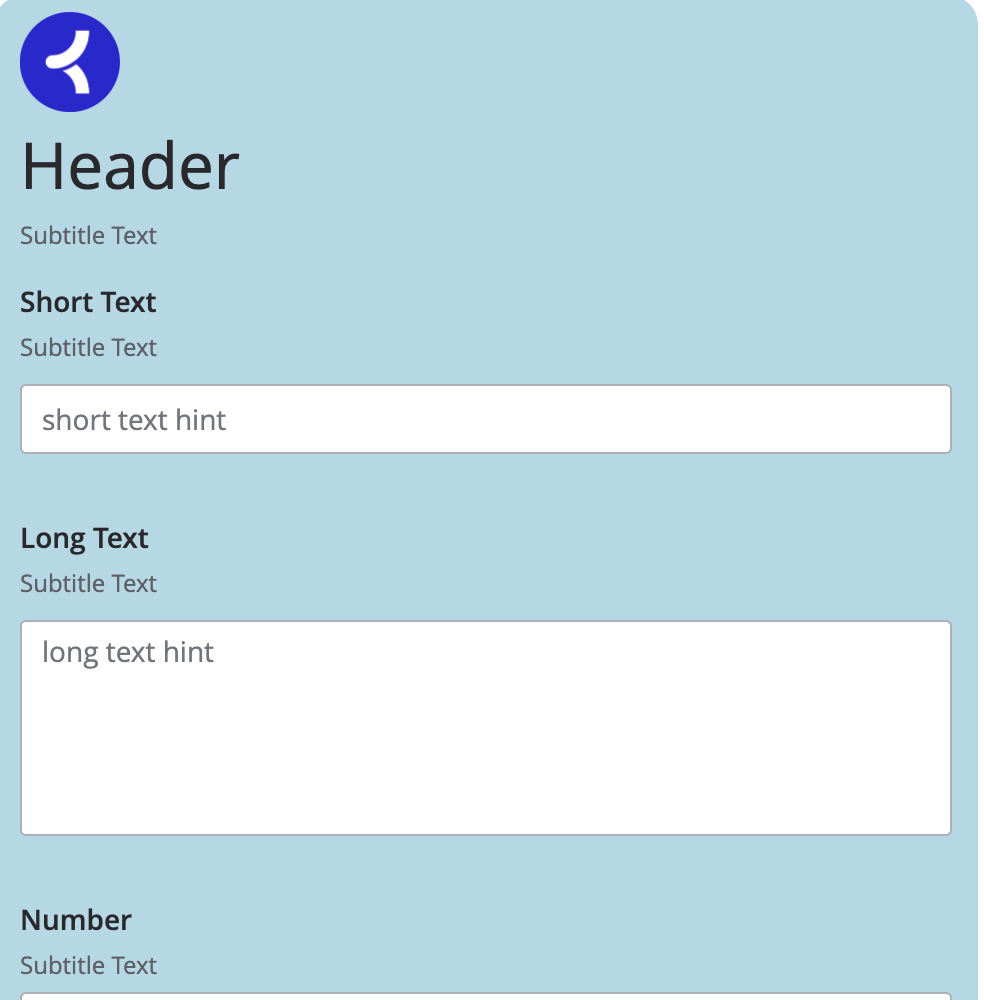
You can change the background using the .secureFormMainContainerBackground class.
Here is an example:
.secureFormMainContainerBackground {
    background-color: lightblue;
}
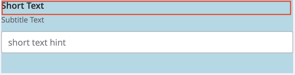
Main Container
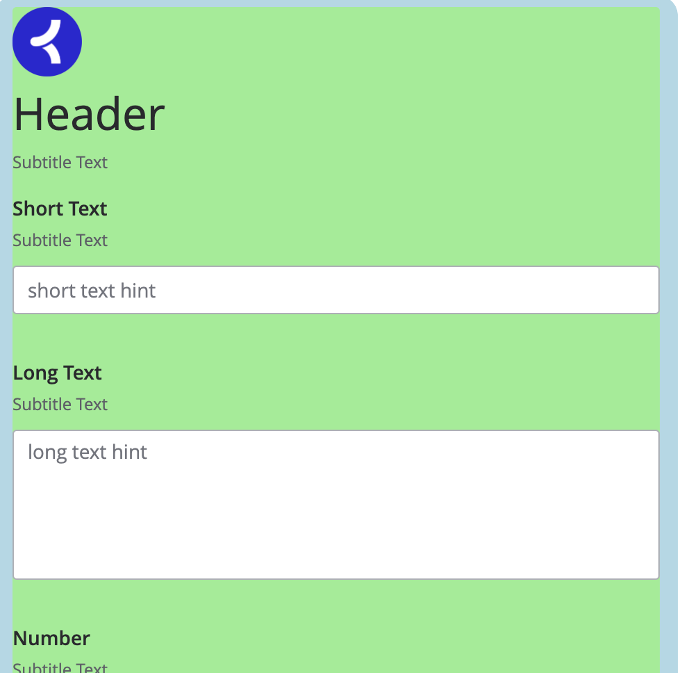
The main container holds the bulk of the widget's content. It can be targeted using #formContainer.
Here is an example:
#formContainer {
    background-color: lightgreen;
}
Header
Container
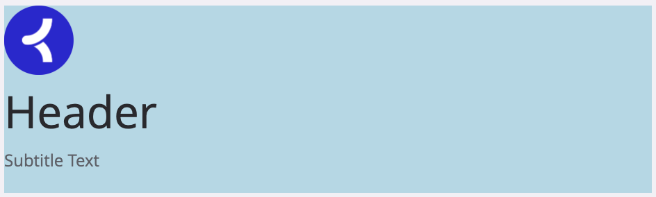
You can adjust this element using the .headerFieldContainer class.
Here is an example:
.headerFieldContainer {
    background-color: lightblue;
}
Icon Container
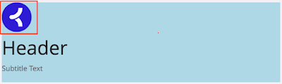
This element can be adjusted using #headerFieldIconContainer.
Here is an example:
.headerFieldIconContainer  {
    margin: auto;
}
Icon
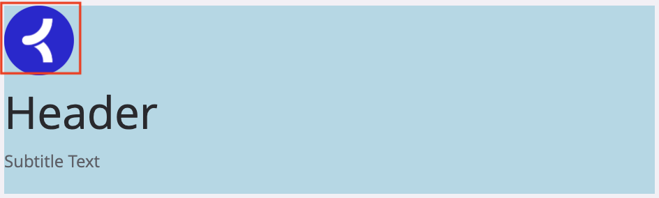
You can change the icon image properties using .iconImage.
Here is an example:
.iconImage {
    height: 50px;
    width: 50px;
}
Text Container
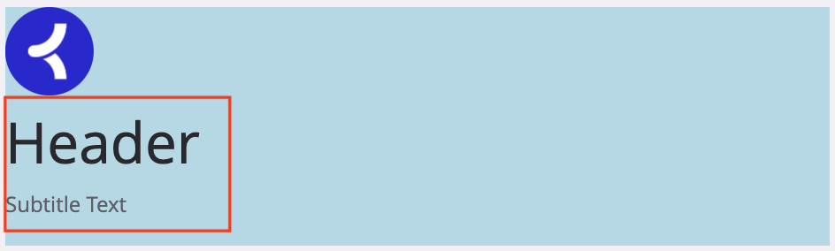
The .headerFieldTextContainer class targets the text container holding the text and subtitle text objects.
Here is an example:
.headerFieldTextContainer {
    background-color: lightblue;
}
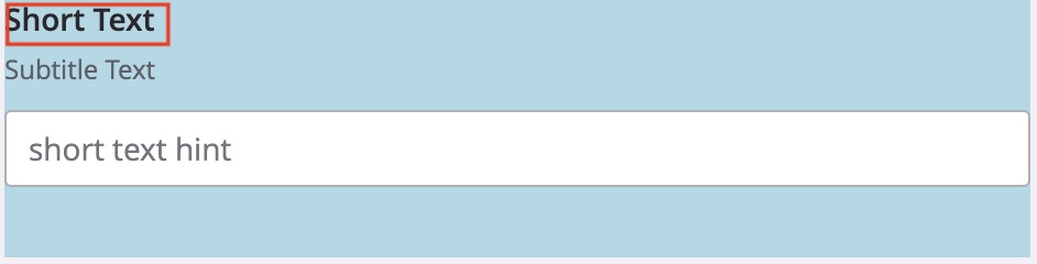
Header Text
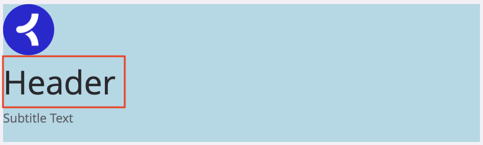
Using .headerFieldTextContainer > h1, you can target just the header text within the widget.
Here is an example:
.headerFieldTextContainer > h1 {
    font-weight: 600;
    font-size: 2.0em;
}
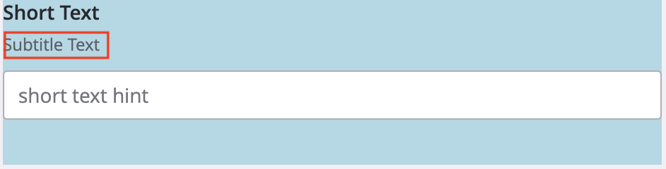
Subtitle Text
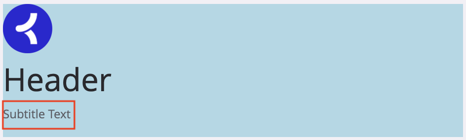
The .secureFormFieldSubtext selector gives you the ability to customize the subtitle text that appears under the header text.
Here is an example:
.secureFormFieldSubtext {
    color: gray;
    font-size: 0.8em;
}
Common Classnames in Fields
Label Container
The .secureFormFieldLabelWrapper selector targets the label wrapper.
Here is an example:
.secureFormFieldLabelWrapper {
    background-color: lightblue;
}
Label Text
The .secureFormFieldLabel selector focuses on the text of the field's label.
Here is an example:
.secureFormFieldLabel {
    font-weight: 600;
    font-size: 1.2em;
}
Subtitle Text
The .secureFormFieldSubtext selector targets the subtitle text for the field.
Here is an example:
.secureFormFieldSubtext {
    color: gray;
    font-size: 0.8em;
}
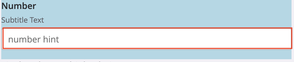
Error Icon
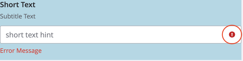
The .inputErrorIcon selector targets the error icon that appears when a field has an invalid input.
Here is an example:
.inputErrorIcon {
    height: 15px;
    width: 15px;
}
Error Message

The .secureFormErrorMessage selector focuses on the error message that appears below the field whenever invalid input is detected.
Here is an example:
.secureFormErrorMessage {
    color: red;
}
Short Text Input
Container
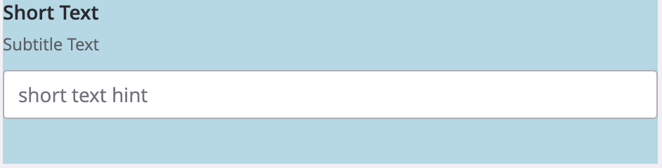
The .shortTextFieldContainer selector enables you to customize the area of the short text input field.
Here is an example:
.shortTextFieldContainer {
    background-color: lightblue;
}
Input Container
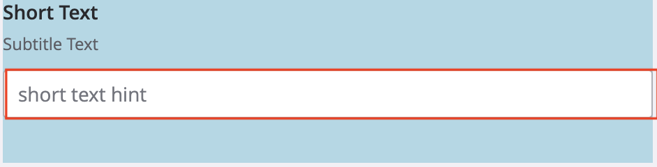
The .shortTextInputWrapper selector targets the wrapper containing the input box.
Here is an example:
.shortTextInputWrapper {
    background-color: lightblue;
}
Input Box
The .shortTextInputArea selector targets the text input field itself.
Here is an example:
.shortTextInputArea {
    width: 75%;
}
Long Text Input
Container
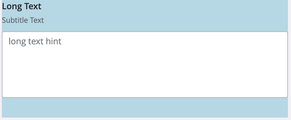
The .longTextFieldContainer selector enables you to customize the area of the long text input field.
Here is an example:
.longTextFieldContainer {
    background-color: lightblue;
}
Input Container

The .longTextInputWrapper selector targets the wrapper containing the input box.
Here is an example:
.longTextInputWrapper {
    background-color: lightblue;
}
Input Box
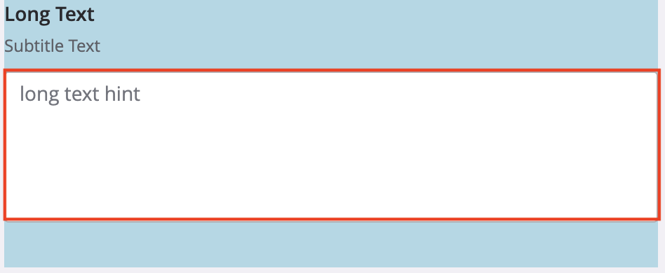
The .longTextInput selector targets the text input field itself.
Here is an example:
.longTextInput {
    width: 100%;
}
Number Input
Container
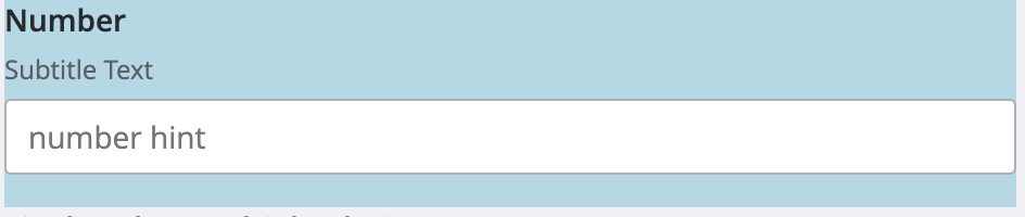
The .numberFieldContainer selector enables you to customize the area of the input field.
Here is an example:
.numberFieldContainer {
    background-color: lightblue;
}
Input Container

The .numberInputWrapper selector targets the wrapper containing the input box.
Here is an example:
.numberInputWrapper {
    background-color: lightblue;
}
Input Box
The .numberInput selector targets the text input field itself.
Here is an example:
.numberInput {
    width: 100%;
}
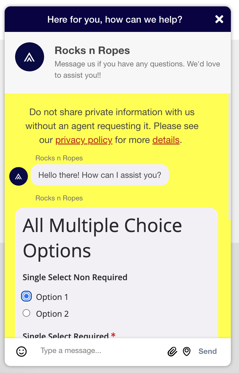
Multiple Choice Input
Container
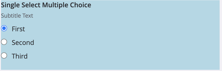
The .multipleChoiceFieldContainer selector enables you to customize the area of the multiple choice field.
Here is an example:
.multipleChoiceFieldContainer {
    background-color: lightblue;
}
Option Container
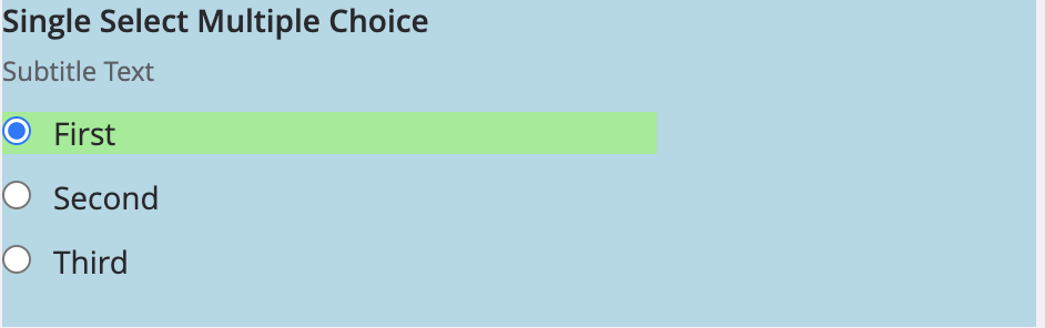
The .multipleChoiceLabelWrapper selector targets the container containing both the option label and interactive checkbox or radio button.
Here is an example:
.multipleChoiceLabelWrapper {
    background-color: lightblue;
}
Option Label
The .multipleChoiceLabel selector targets the label of each option.
Here is an example:
.multipleChoiceLabel {
    font-size: 0.9em;
}
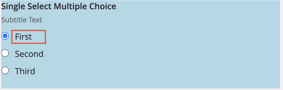
Single Select Radio Button
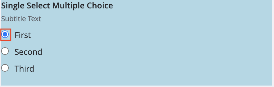
The input[type="radio"] selector targets radio buttons within the multiple choice field.
Here is an example:
.multipleChoiceLabelWrapper > input[type="radio"] {
    margin-left: 1em;
}
Multi Select Checkbox
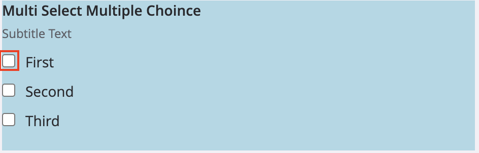
The input[type="checkbox"] selector targets checkboxes within the multiple choice field.
Here is an example:
.multipleChoiceLabelWrapper > input[type="checkbox"] {
    margin-left: 1em;
}
Date Input
Container
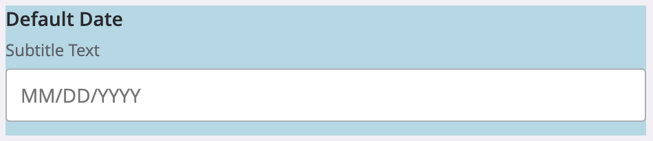
The .dateFieldContainer selector targets the area of the date input field.
Here is an example:
.dateFieldContainer {
    background-color: lightblue;
}
Date Input Container

The .dateInputWrapper selector targets the wrapper containing the date input field.
Here is an example:
.dateInputWrapper {
    background-color: lightblue;
}
Date Input
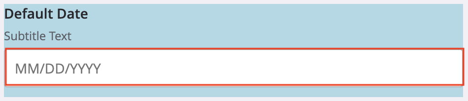
The .dateInput selector targets the date input field.
Here is an example:
.dateInput {
    height: max-content;
    width: fit-content(20em);
}
Submit Button
Container
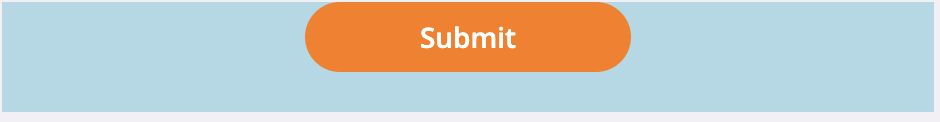
The .secureFormFooter selector gives you the ability to customize the area of the submit button.
Here is an example:
.secureFormFooter {
    background-color: lightblue;
}
Submit Button
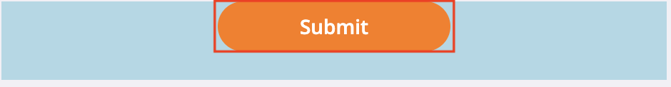
The #submitButton selector targets the button that submits the form.
Here is an example:
#submitButton {
    margin: auto;
}
Updated 9 months ago